Excel BI Tip #27: CUBESET and CUBESETCOUNT Functions

As I mentioned in my original post, Exploring Excel 2013 as Microsoft’s BI Client, I will be posting tips regularly about using Excel 2013 and later.  Much of the content will be a result of my daily interactions with business users and other BI devs.  In order to not forget what I learn or discover, I write it down … here.  I hope you too will discover something new you can use.  Enjoy!

CUBE Function Overview

In Tip #18, I talked about the CUBEMEMBER and CUBEVALUE functions which can be used to refer to cube data directly. In this tip, we will look at CUBESET and CUBESETCOUNT. These functions return sets that can be applied to the CUBEVALUE function like the CUBEMEMBER function. They allow you to create custom sets which can be used for calculations such as trailing 12 months, top 10 performers, or the number of customers with sales in 2009. Keep in mind that the advantage of using the CUBE functions with SSAS data is that it allows you to go beyond the limiting capabilities of pivot tables using that data and MDX.

CUBESET Function

The CUBESET function is designed to return a valid MDX Set from the cube or tabular model. The construction of the formula is CUBESET(“connection”,”set expression”,”caption”,”sort order”, “sort by”). Only the connection and set expression are required. However, I highly recommend using the caption. The caption is what will show in the cell with the formula. If you don’t include the caption, the cell will appear empty so you will need mark it in some way. Before I started using the caption, I color coded the cell so I would make sure not to overwrite that cell. In a nutshell, use a caption to make your solution more usable.

Simple Set Example

In this example, we are going to pick a list of college level Education attribute members from the Adventure Works sample cube. Education is an attribute hierarchy that is part of the Customer dimension. Here is the MDX for that set:

{[Customer].[Education].&[Bachelors], [Customer].[Education].&[Graduate Degree]}

Here is how I used that in Excel with the CUBESET function (AdvWorks is my connection name).

=CUBESET(“AdvWorks”,”{[Customer].[Education].&[Bachelors], [Customer].[Education].&[Graduate Degree]}”,”Completed College”)

While this is a simple example, any MDX set will work in the expression. If you need to create a set dynamically such as a Trailing 12 Months or Top 10 set it will work just as well. Work out the set in SQL Server Management Studio and then put it into a cell and refer to that cell when creating your cube value.

CUBESETCOUNT Function

The CUBESETCOUNT function can be used to count the members in a set returned by a a CUBESET function. In MDX we use .count or COUNT() to determine the number of members in a set. This does not work with the CUBESET function and thus we have CUBESETCOUNT. This is a fairly simple function to use, but it is very powerful if you are trying to do dynamic set counts based on reference data on your spreadsheet.

Counting a Set of Customers with Sales for the Selected Period

In this example, we have created a set which returns customers with orders in 2011. We will count this set using the CUBESETCOUNT function to determine the count. In Excel, we could use the NOW() function to get the current year or some other dynamic value to build the set. However, Adventure Works is a static set so I am using a single year in the example.

nonempty( {([Customer].[Customer].[Customer],[Measures].[Internet Order Quantity])},[Date].[Calendar].[Calendar Year].&[2010])

This can be put into a CUBESET function as follows:

=CUBESET(“AdvWorks”,”nonempty( {([Customer].[Customer].[Customer],[Measures].[Internet Order Quantity])},[Date].[Calendar].[Calendar Year].&[2010])”)

Next, we put the CUBESET function into the CUBESETCOUNT function.

=CUBESETCOUNT( CUBESET(“AdvWorks”,”nonempty( {([Customer].[Customer].[Customer],[Measures].[Internet Order Quantity])},[Date].[Calendar].[Calendar Year].&[2010])”))

This can now be used as a value for other calculations. For example, you could show the average sale amount for customers who purchased something this year or even the average purchase amount this year for those who ordered last year to see if your repeat customers are buying more.

Wrap Up

Using these functions with other CUBE functions increases the flexibility of your dashboard solution and allows you to make many more creative visualizations. Remember to use captions with CUBESET functions you plan to use in your formulas and you need a CUBESET result to count with CUBESETCOUNT.

Excel Tip #25: Overlaying Charts

As I mentioned in my original post, Exploring Excel 2013 as Microsoft’s BI Client, I will be posting tips regularly about using Excel 2013 and later.  Much of the content will be a result of my daily interactions with business users and other BI devs.  In order to not forget what I learn or discover, I write it down … here.  I hope you too will discover something new you can use.  Enjoy!

Making a cooler Excel chart by overlaying charts

This is one of the coolest techniques when creating compelling chart visualizations in Excel. The concept is to overlay one chart on another such as line chart over a bar chart which is our example. This is really helpful when showing data that has very different granularity or scale. In the example we will do below, we are going to show the number of tickets each hour of a day with the % spending on alcohol for that time period. Let’s get started.

Step 1 – Create the bar chart

We are creating a bar chart that shows the number of tickets created during each hour of the day at my fictional restaurant – Sensational Servings. In my bar chart, you can see that I added a title, removed the legend, and hid the field buttons. Here is the resulting chart.

image

Step 2 – Create the line chart

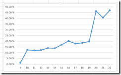
Next, we create a line chart that shows what % of the total ticket amount for that hour of the day was on alcoholic beverages. I will not add a title to this one and I will hide the buttons and the legend as well. I will also convert this to a line chart so we can see the trend through the day as a line.

image

Step 3 – Set up the line chart to be overlaid on the bar chart

In this step, we will walk through the settings that make line chart ready to overlay. In my scenario, you may have already noticed that the list of hours are different on the Y-axis. In order to overlay the charts, they must represent space that can be overlaid. In this example, we need to make sure that the Y-axis on both charts match. We expect that the X-axis will be different as we have a count and a percentage we want to compare. In most cases you need to have one of the axis represent the same values so you can compare the other. However, you may have a situation where this does not matter. As we move through the rest of the example, you can adjust to your data visualization needs accordingly.

In order to set the hours the same, we will show empty values for the Hour of the Day. (NOTE: you may need to do this with both charts to prevent unexpected results.) You can make this change in the PivotChart Options dialog on the Display tab.

image

Here is the result:

image

Here are the other changes we will make:

  • Make the background transparent
  • Remove the Y-axis label
  • Move the X-axis label to the right side
  • Remove the lines in the chart

Let’s do the labels first. To remove and move the respective labels, you can use the cross that is displayed on the upper left corner of the chart. image  The first change is unselecting the Primary Horizontal axis from the Axes menu. From here you click the Axis option and then go to More Options. That will open a side panel with more options from which you can make the necessary changes. On this panel, you need to open the Format Axis page. You will see an option for Labels near the bottom. To move the X-axis to the right side you need to select Low or High. This will depend on the data in your axis. The change is applied immediately so you should see the change. In the example we need to change it to High.

image

While leaving the format panel open, select the one of the gridlines. This will open the Format Major Gridlines menu. Select the No Line option and these will be removed. Once you have completed that, select the entire chart and set the fill to No Fill in the Format Chart Area and select No Line for the border in the same section.

As with many Microsoft products there are other ways such as ribbon commands to change fill and line options. You should explore other options to see which method is the most intuitive for you. However, the format panel has the most complete set of options which are grouped for the section of the chart you are modifying which is why I used that for most of the changes here.

Once all these formatting changes have been made you should see the Excel gridlines behind your line chart and it should look as follows:

image

Now the line chart is ready to be overlaid on our bar chart.

Step 4 – Overlaying the charts and finishing touches

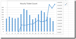
The final step is both the simplest and most annoying. You will need to drag the line chart on to the bar chart. Making no changes here is what my initial attempt looks like.

image

You will notice that the axis labels from the line graph are outside the bar chart border, the line is not sized to be meaningful and the points on the line chart are not matching the Y-axis labels on the underlying chart.

Here are the steps I took to get this chart the way I wanted.

  1. Made the bar chart wider. I did this to get the space I wanted to include the labels in the chart.
  2. Made the plot area on the bar chart smaller. This opened up white space on the right side for the line chart labels
  3. Next, I made the line chart shorter. Keep in mind that without a chart title the chart expands to fill. By reducing the height of the line chart it will fit in with the title and the labels will fit into the plot height of the bar chart.
  4. This step is the most painful. I lined up the points with the bars and made sure that 0% was lined up with the bottom of the bar chart. This takes patience to get it looking right.
  5. Finally, I changed the color of the line to read so the contrast can be easily seen.

Here is the result.

image

Now we can see alcoholic beverages account for much more of the overall ticket amount as the day goes one. By adding slicers for thinks like day of the week we do further analysis such as seeing if Fridays are the biggest percentage and so on.

Wrap Up

This illustration shows one of the most common scenarios to overlay charts. Using a percentage to see a trend related to the underlying values shown in the bar chart helps understand correlation. If you use slicers on your dashboard, make sure that you connect them to both charts (if you want them both filtered by the slicer of course).

Power Testing ETL with Power BI – Creating the Tests with Power Pivot

PowerTool_1This is the second deep dive into Power Testing ETL with Power BI. At this point, we have created the source table which will be used in our testing. The next step is to bring in the destination table and create the tests that will be “run” against the data. In its simplest form the tests are created using logical conditions based on whether source data matches destination data and calculations applied to those data sets also match. When they don’t match, you have data load error which results in a failed test.

How to Calculate Success and Failure

The basics of the testing is turn the results into numbers and calculate if and how much we succeeded or failed. Typically, every test will result in a 1 or 0. Whether you assign 1 to success or failure is largely dependent on how you plan to display your results. If you plan to use KPIs built into the Power Pivot model, you will be comparing the number of successful tests against the number of rows expected to be imported. The primary reason for this is that you cannot target zero when using KPIs. In this scenario, successful tests result in 1 and are therefore easily compared to the number of expected rows which would be 100% successful if they matched.

The other scenario is to measure failures. In this case, we assign 1 to each failed test and count the number of failed tests. This can easily be handled in visualizations such as conditional formatting where 0 can be displayed as green and the number of failures change the state from from green to yellow then red. This helps identify the most commonly failed tests.

The method you choose is up to you and how you prefer to see the results. We will cover using both variations in visualizations, but for sake of brevity here, we will measure success against our row count. Success = 1; Failure = 0.

Creating the Power Pivot Tests

In order to create the tests, you need to open the Power Pivot window and add the destination table to the model. In our case we have created a table in the HughesMediaLibrary database called books that is our target. Here is the syntax for the target table.

CREATE TABLE dbo.Books(
BookID int IDENTITY(1,1) NOT NULL
CONSTRAINT pk_Books PRIMARY KEY CLUSTERED,
BookName varchar(100) NOT NULL,
Publisher varchar(100) NULL,
Genre varchar(50) NULL,
CopyrightYear smallint NULL,
AuthorFName1 varchar(100) NULL,
AuthorLName1 varchar(100) NULL,
AuthorFName2 varchar(100) NULL,
AuthorLName2 varchar(100) NULL,
AuthorFName3 varchar(100) NULL,
AuthorLName3 varchar(100) NULL,
AuthorFName4 varchar(100) NULL,
AuthorLName4 varchar(100) NULL,
AuthorFName5 varchar(100) NULL,
AuthorLName5 varchar(100) NULL,
PageCount int NULL
)

While I realize this is not a good normalized table, it serves our purposes well to build out the tests. This table needs to be added to the Power Pivot model before we can do the next steps.

Relating the Source and Destination

The next step is to relate the source and destination. In our case, the only data that will work is the book name. We will use the Source table as the primary table in this relationship. The idea is that all the data in the source table should exist in the target. As this is not always the case, the source is the “source of truth” for the testing scenario.


Building the Tests

The tests are comprised of calculated columns that handle data analysis and calculated measures which summarize results.

Validating Data Field by Field,  Row by Row

This is the primary reason that we worked with Power BI. One of the most common testing scenarios is whether the data came over correctly. In the previous post, we shaped the data with Power Query. Now we will compare it with the results from our ETL process in SSIS. We will use Book Name as the example. Every field you wish to test can follow this pattern. The test consists of a calculated column and a calculated measure.

We create a column in the destination table called Book Name Matches. (Remember we are tracking success not failures.) In each row of the data we need determine that the book name in the destination is the exact match for the book name in our source. We used the following DAX for that calculation:

=IF(RELATED(‘Booklist Source Fixes'[BookName])=’Media Library – Books'[BookName],1,0)

It looks at the related table to determine that the field names match. If they match, the test is assigned a 1 for that row. If they do not match, a 0 is assigned. (The table names are how I named the source and destination. They may not match your solution if you are following along.) Once we have the rows evaluated, we will sum the values with a Book Name Matches measure:

Book Name Matches (34):=SUM([Book Name Mismatch])

We will use the Book Name Matches (34) measure to compare with the book count. If they match, all tests passed. If they do not, then some or all rows have failed.

The number after the measure, 34, is the test key from TFS. I added this into the measure to make it easier to identify which test case is being evaluated with this measure. In some cases, you may have multiple measures that are required to complete a test. You can either evaluate them independently or create and additional measure that summarizes them for your use.

Other Validations or Tests

Some other basic validations can be created as well. A common one would the book count. In my scenario, I return the book count then evaluate it using a KPI. Another way to do this is to add another measure that checks for equality between the two book count measures in the source and destination. If they match, success. If not, failure.

You can also use measures to validate expected totals the same way we were working with counts. This is particularly helpful in financial data loads where you would want to verify a sum of balances to make sure the results match. The point is that you can add any other measures that you want to compare in order to meet the unique needs of your situation. It is also possible that you can compare to entered values. If you know that 100 widgets are to be imported, you can have the measure evaluate against 100 instead of  a measure in the source.

Recording the Results in TFS

In order to bring the process full circle, we enter test results into TFS or Visual Studio Online. This allows us the ability to track test results, bugs, and fixes in a development lifecycle tool. It is also the best way to track testing history. One caveat here is that the query results from TFS do not permit you to set test results in Excel. Ideally, we should be able to link in the tests with the results. We could then update the results in the query and push it back. This is NOT supported at the moment. As a result, you will need to open the tests in TFS to update your results. This is not a significant issue because you should also create bugs for failed tests. It’s primarily a nuisance.

An added side effect of using this method to test is that we are able to collaborate with developers to determine what the bug actually is. Because all the data is loaded into Excel reviewing results is fairly simple and may actually be easier than trying to look at the destination system.

Quick Look at SSIS

Up to this point, we have focused on how an non-developer can set up the source and destination and proceed to test. I wanted to call out the author name work done in Power Query to highlight why Power BI is a great choice. When splitting author names, the work was done using right-click operations. Here is an example of the expression code used to split out the second author name column:

(DT_STR,200,1252)TRIM((FINDSTRING(AuthorNames,”,”,1) == 0 ? NULL(DT_WSTR,200) : TRIM(SUBSTRING(AuthorNames,FINDSTRING(AuthorNames,”,”,1) + 1,FINDSTRING(AuthorNames,”,”,2) == 0 ? LEN(AuthorNames) : 1 + LEN(AuthorNames) – FINDSTRING(AuthorNames,”,”,2)))))

Compared to Power Query, this is complex and not intuitive. While Power Query is not intended for enterprise ETL use, it’s simplicity helps test complex scenarios such as our author name split without having to create and equally complex SQL statement or expression.

The next post will take a look at some of the visualization options for the test results.

Power Testing ETL with Power BI – The Process

PowerTool_1This is a short blog series on using Power BI tools to support testing ETL processes. I have presented on this subject at few SQL Saturdays over the past few years and am finally succumbing to multiple request to turn it into a blog post. Realizing the amount of content is more than I typically would put into a single post, I will be putting together this short series to cover the material. The first post is this one. It will walk through the entire process at a high level. I will follow this post with a deeper look at Power Query’s role in the process. The third post will cover Power Pivot and building out test cases. Finally, we will wrap the series up with some visualization ideas for Excel and Power View. You can find all the posts as they come online here. Let’s get started.

The Problem Area

Why use Power BI to test ETL? While working as the architect on an ETL project for moving data from third party web service to an on-premise financial solution, we needed to put together a testing strategy that could be implemented by non-developers on the project. Our situation was that our project was “too small” to engage our QA team but the requirement for reusable testing needed to be fulfilled. Our project team consisted of a BI architect (that would be me), an ETL developer, and a business analyst (Chuck Whittemore).

NOTE: We are testing the data transformations and data load. This is not intended for auditing or performance. There are other tools for reviewing those including the built in reporting in SSIS and Pragmatic Works’ BI xPress tool. If you are tracking whether a package fails or succeeds, you should use either of these options not this process.

The Big Idea

The BA and I were discussing options for testing and we theorized that we could use a new add-in for Excel (Power Query, still in preview at imagethe time) with Power Pivot to build out tests. The key to success on this project is that we needed to be able to test with non-developer tools, no SQL Server Management Studio or SSIS could be involved in the testing. The primary reason for this is that he would be doing the testing. We also did not want to recreate every step in the ETL process the same way. So, time to put theory into practice. We determined that we would create test cases in Visual Studio then build out tests to match those cases in Excel using the Power BI add-ins. He would do the work in Excel and we, the developer and I, would provide technical support as needed.

The Recommended Tools

Before we dig into the process, I want to lay out the tools used for development and for testing. While this solution can use other tools, it is important to know what we used in practice to create our solution.

ETL Development Tools

imageThe ETL development was done using SQL Server Integration Services (SSIS). At the time, we needed to use Script tasks to consume the web service content. The financial system used a custom load process that we dumped formatted data into a file for the system to pick up and load.

In the examples, I use in the presentations and will lay out here, I will be using a text file to SQL Server implementation. While complex ETL problems are common and hard to test, this simplified version is easier to follow in examples. You should be able to apply the principles used here to test any solution.

Testing Tools

imageThe testing development for the referenced project consisted of Excel with Power Query and Power Pivot. Power Query was in preview at the time, so we had some of the performance issues and early bugs to work through. None of these issues, prevented us from completing the project.

The presentation solution relies on the latest version of Power Query (which changes every month) and Power Pivot in Excel 2013. Most of the examples are easy to follow, but you should be able to solve most transformation tests with the combination of Power Query and Power Pivot. Definitely do not discount the capabilities of Power Query and the fact that new functionality is being added each month.

Team Foundation Server/Visual Studio Online

imageBoth projects use the online version of TFS. If you are currently not using a source control and work tracking solution, I highly recommend you look at the online version of TFS. It will allow you up to 5 users free and give you ability to use source control, create test plans, create test cases, log bugs and track changes. These are key features necessary to complete a good solution that can be managed and tracked.

The Process

image

I am going to walk through my demo to build out the process steps. This will allow you to see examples. I will call out any thing of relevance related to the project here as well.

1. Business Rules

The first part of any project, especially in ETL, is to understand the business rules. If you are working with a data warehouse project, this may be fairly well documented in a dimensional model. In both of our cases here, we are moving data from one system to another. The transformations and business rules are primarily driven by the target system. Here are some examples of business rules in the media library sample project.

  • Author names are stored in separate columns – FirstName and LastName
  • If an author’s name include a middle name or initial or some variation, this combination should be stored in the first name column. For example, J.R.R. Tolkien would be stored as follows:
    — FirstName: J.R.R.
    — LastName: Tolkien
  • Copyright year should be stored as a 4 digit value
  • Page numbers should not exceed 1000

Every project has some type of business rules. It is hard to build out transformations and create test cases without these rules.

2. Source to Target Map

This is the single most important document for the tester. It tells the tester how the developer is getting from source to destination and what type of data massaging needs to be handled. Typically, people use some variation of the example created by the Kimball Group over the years.

3. Developing SSIS

The developer begins the process of creating the SSIS package. He will be using the Source to Target Map as his guide and will update that document to handle special cases in the data as needed. Ideally he is working in a development environment that will allow for test build outs as well.

4. Creating Test Plans and Test Cases

The tester creates test plans and test cases in TFS. These tests are based on business rules and the source to target map. Depending on both the complexity of the solution and the time to develop, some test cases could be did the table move the correct data field for field and row count. This method can be particularly useful when working with large tables or simple data flows. However, you should have a test case for every transformation that massages the data. This will insure that the data is being transformed as expected.

image

Keep in mind, this solution will support test cases for each field in a data load if required. The tester and architect should evaluate what is the appropriate amount of coverage to guarantee the highest level of quality in the data transform. As always, there is a diminishing rate of return if you “test everything” at the lowest level. It will be expensive in terms of cost of development when the chance for error is minimal. It will also take substantially longer to test everything. You need to understand and be able to articulate how the testing was accomplished and your level of confidence in the results.

5. Building the Tests

This is the most extensive part of the process besides the SSIS development. I will not go into all the details here, but will walk through the overall process and principles. I will provide detailed examples in the follow up posts as noted above.

Let’s start with the end result. Chuck and I were able to determine that we could use DAX to create comparative formulas on data that could be brought into Power Pivot from both the source and the destination. Essentially, we wanted to use math to determine the results of the tests. So in our example, we use a formula like “if Source.CopyrightYear = Destination.CopyrightYear, then it passes, else it fails.” Depending on how you want to measure, pass could be 0 or 1. Then we add the values up to determine if data passed or failed the test. We can even tell you failure rates.

In order to get the data in a comparative state, we needed each table in the destination with a table that matched from the source. However, it is very common that sources and destinations are not one-for-one table matches. This is where Power Query comes in. Using Power Query in our example set we bring in the text file and massage or shape the data to look like the destination. Most importantly, we need to apply all business rules and transformations to the source. Once this is done, we do no massaging on the destination data. This allows us to compare what the ETL process did with what our tests say it should have done.

A key part of being able to compare is the ability to relate the two tables in Power Pivot. You need to be able to match natural keys or derived keys between the two sources. The relationship should be from the destination table to the source table. Without this relationship, you will not be able to build the calculations for the tests. Keep in mind the goal is to get our source to look like expected results. Any data in the destination should match the source in our scenario.

image

Once both tables are created and loaded into Power Pivot, we can complete the tests using DAX. In some cases, we create calculations on both tables to be compared. A classic example is row count. We count the number of rows in the source table and the destination table. Then we create a calculation on the destination to compare values. This meets the requirements of a row count test case (e.g. all data was successfully imported).

Another example of a test is to compare the content in a field from source to destination. This is where we use a lot of conditional logic to verify the contents of a field in a row is the same in both tables. Calculated columns (not measures) are used to create the comparison results. The conditional statement should result in a number. This is important in order to create a measure that sums up the results to determine if errors exist or not. If you choose success to be 1, then you will check your results against the row count to determine if there are errors. If you choose failure to be 1, then a nonzero count means you have errors. There is no right or wrong way to handle this, you would choose based on visualization techniques. Most of the time, using 1 for failures is fine. However, if you want to create KPIs, you will likely need success to be one so you have a good target to work with.

6. Testing the Initial Load

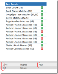
Once you have created the tests, you are ready to test the initial load. You will connect to both sources. Ideally, your source will not change so you can redo the test multiple times, but this will work regardless. Refresh the data which may require rerunning the Power Query query. Once you have refreshed the data you should be able to check the calculations in a simple pivot table to determine what tests have succeeded or failed. This is the beauty of this solution. Each subsequent execution of SSIS, you will be able to refresh your data and review your results to determine how successful the ETL is.

image      image     image

A side effect of this work is that the developer can review the test results in Excel and Power Pivot with you to more easily find the discrepancy in the data transform. In some cases, the tests are in error as well. It is important that the developer and tester work together to determine cause as well. A good team will be able to work through issues rather quickly.

7. Recording Bugs and Issues

You will need to go back to Visual Studio to change the pass/fail for each test. If a test fails you can log a bug for the developer and you that information to determine if it was fixed prior to a subsequent run. It is likely that multiple sprints will be required to complete the work so you can work with your team to determine the best ways to communicate what is ready. If you track the work in TFS, you will queries are available to help you see what work has been completed.

You can determine if the fix worked and then set the test results accordingly. This will help show progress on the project as well.

8. Visualizing the Results

You can visualize your results using KPIs, conditional formatting and even Power View. If you have a project that needs to be easily evaluated you can publish your results to SharePoint and use charts and graphs to show how accurate the process is so far.

image  image

We will dig into visualization options more in a following blog post.

Tracking Test History

No solution is perfect and that is true here as well. One of the most common questions is how do we see the historical results? This solution does not easily provide for that. I am looking at options, but for the moment the idea is that the history will be tracked through TFS. However, you could save the workbook after each iteration. This will give you some history, but you would want to make sure that you don’t refresh data on a historical workbook or the results would be overwritten.

Some final thoughts.

Power Query is not an ETL tool. It’s target destination is always the same – Power Pivot. While it’s ease of use makes it appear to be a tool to be used for ETL, it is not there yet. However, it is in its ease of use that we have a place to work with it here.

My plan is to have some deeper technical dives into parts of the solution in the future.

Exploring Excel 2013 for BI Tip #12: Icon Sets

As I mentioned in my original post, Exploring Excel 2013 as Microsoft’s BI Client, I will be posting tips regularly about using Excel 2013.  Much of the content will be a result of my daily interactions with business users and other BI devs.  In order to not forget what I learn or discover, I write it down … here.  I hope you too will discover something new you can use.  Enjoy!

Using Icon Sets

So far we have covered the data bar and color scale options in conditional formatting. Up next is Icon Sets. This conditional formatting option can be very valuable when creating dashboards using Excel.

image_thumb1_thumb

Icons in Brief

Excel has a number of icon sets that can be used to visualize status and trends. These are organized in Excel into groups based on their usage as shown in the image below.

image

Your specific use case including the data measured and the message to communicate will determine which icon set you choose. Often icon sets are used in scorecards and with key performance indicators (KPIs).

Creating a KPI with an Icon Set

When making a choice on icons, it is important to keep in mind what you want to communicate and who your audience is. In the following example we will look at setting up a KPI or status icon set using the tri-color, differing shape set.

image

This is a good choice to represent data that can be shown as “good”, “warning”, or “bad” status.

Using shapes as well as colors is particularly helpful if you have color blind users.

In my example, I am using a pivot table using Power Pivot data. I have a series of poll questions and the number of submissions. Let’s start with the default implementation. First, click into the cell with the value (in my case, Submission Count). Next, select Conditional Formatting > Icon Sets > <<select the shape noted above>>. This will put an indicator in the field as noted below.

image

As you can see only the field selected has the icon set. What we need to do is apply the formatting to the entire column. That is done by clicking in the cell and then clicking the formatting button that pops up by the cell.

image

This button will show the following selections for applying formatting rules:

  • Selected Cells (currently selected)
  • All cells showing “Submission Count” values
  • All cells showing “Submission Count” values for “PollQuestion”

Obviously, you would see your value column and your reference column names. If you have nested reference columns (e.g. a poll type) you would want to select the third option so it only was measured against the values in scope with the initial reference column. The second option will apply the formatting to the entire column no matter the level in the pivot. For this example, we will use the third option. Now look at the column results:

image

As you can see, the formatting has been applied to the entire column. Curious how it was applied? In the ribbon, select Conditional Formatting > Manage Rules. In that dialog, you should see the rule you created. With that rule selected (which is the only rule if you started new), select Edit Rule. In the resulting dialog, you can see that you can change how the rule is applied, the rule time, and the description. Here we will focus on the description. In the description area, you can see the Icon and the values that are applied. By default, it groups it in to percents. This is done by taking the maximum and minimum values and dividing the values into thirds and applying the value.

image

You can change the type from Percent to Number, Formula or Percentile. I often find that I need to use a number for that goal. However, if you use a formula you can refer to a sheet with goals, for instance, that let’s you do some what if scenarios as well.

You can also show the icon only which gets closer to the look and feel of a scorecard. I encourage you to explore the possibilities and create scorecards that can be used by your executives, managers, and other users who need to get an overview of how things are going.