Excel Tip #29: Forcing Slicers to Filter Each Other when Using CUBE Functions

As I mentioned in my original post, Exploring Excel 2013 as Microsoft’s BI Client, I will be posting tips regularly about using Excel 2013 and later.  Much of the content will be a result of my daily interactions with business users and other BI devs.  In order to not forget what I learn or discover, I write it down … here.  I hope you too will discover something new you can use.  Enjoy!

Scenario

You have went to all the trouble to build out a good set of slicers which allow you to “drill” down to details based on selections. In my example, I have created a revenue distribution table using cube formulas such as:

=CUBEVALUE(“ThisWorkbookDataModel”,$B6, Slicer_Date, Slicer_RestaurantName, Slicer_Seat_Number, Slicer_TableNumber)

image

Each cell with data references all the slicers. When working with pivot tables or pivot charts, the slicers will hide values that have no matching reference. However, since we are using cube formulas the slicers have no ability to cross reference. For example, when I select a date and a table, I expect to see my seat list reduce in size, but it does not. All of my slicers are set up to hide options when data is available. There are two examples below. In the first, you can see that the seats are not filtered. However, this may be expected. In the second example, we filter a seat which should cause the tables to hide values and it does not work as expected either.

image

image

As you can see in the second example, we are able to select a seat that is either not related to the selected table or has no data on that date. Neither of these scenarios is user friendly and does not direct our users to see where the data matches.

Solving the Problem with a “Hidden” Pivot Table

To solve this issue, we are going to use a hidden pivot table. In most cases we would add this to a separate worksheet and then hide the sheet from the users. For sake of our example, I am going to put the pivot table in plain sight for the examples.

Step 1: Add a Pivot Table with the Same Connection as the Slicers

In order for this to work, you need to add a pivot table using the same connection you used with the slicers. The value you use in the pivot table, should only be “empty” or have no matches when that is the expected result. You want to make sure that you do not unintentionally filter out slicers when data exists. In my example, I will use the Total Ticket Amount as the value. That will cover my scenario. In most cases, I recommend looking for a count type value that will always have data if there is a potential match of any kind.

image

Step 2: Connect the Slicers to the Pivot Table

Using the Apply Filters button on the Pivot Table ribbon, you need to select all the slicers you want to interact with each other.

image

Once these changes are applied, you will see how my data changed.

image

Now, let’s test this for real. We will keep the date and table, but now we will see that the other slicers are now filtered to match the data that is available.

image

As you can see, the solution is fairly simple, but not intuitive. You will be able to create more creative dashboards with this technique. Keep in mind this issue is primarily a problem when using cube formulas in your Excel dashboard.

Until next time…

Excel BI Tip #28: Using member expressions in the CUBEVALUE Function

As I mentioned in my original post, Exploring Excel 2013 as Microsoft’s BI Client, I will be posting tips regularly about using Excel 2013 and later.  Much of the content will be a result of my daily interactions with business users and other BI devs.  In order to not forget what I learn or discover, I write it down … here.  I hope you too will discover something new you can use.  Enjoy!

CUBEVALUE and CUBEMEMBER

If you have not looked at the cube functions in Excel check out two of my previous posts: Excel BI Tip #18: Using Cube Functions to Break Out of Pivot Tables and Excel BI Tip #27: CUBESET and CUBESETCOUNT Functions. Cube functions allow us to apply MDX functionality in Excel beyond pivot tables and charts. In this post, I will show how you can expand the CUBEVALUE function by directly using member expressions or CUBEMEMBER functions in the syntax. Tip #18 demonstrates how to use cells in Excel.

Typically, you would use these functions separately. For example, CUBEMEMBER is used in column and row headers in a typical solution. Because of this CUBEVALUE usually refers to a series of cells and slicers.

CUBEMEMBER used as a column header:

=CUBEMEMBER(“AdvWorks”,”[Measures].[Customer Count]”)

CUBEVALUE referring to this member:

=CUBEVALUE(“AdvWorks”,$D8,F$7,Slicer_Commute_Distance)

The snapshot below shows how it looks in Excel when the cell with the CUBEVALUE function is selected:

image

Using Member Expressions and CUBEMEMBER

The method illustrated above is how the cells are made when a pivot table has been converted to formulas. However, if you look closely the CUBEVALUE function accepts CUBEMEMBER values. The next few examples show how you can use members directly in the name to get more functionality.

=CUBEVALUE(“AdvWorks”, “[Measures].[Customer Count]”,CUBEMEMBER(“AdvWorks”,”[Customer].[Gender].[Female]”))


=CUBEVALUE(“AdvWorks”, “[Measures].[Customer Count]”,”[Customer].[Gender].[Female]”)


You can use any MDX expression that returns a member as one of the expressions in the function. This includes functions like STRTOMEMBER which allows you to create dynamic functions to get current date. Using member expressions allow for even more customization without dependencies on reference columns.

Adding a Slicer

Finally, you can add a slicer reference to the CUBEVALUE function.

=CUBEVALUE(“AdvWorks”, “[Measures].[Customer Count]”,”[Customer].[Gender].[Female]”, Slicer_State_Province)

Excel BI Tip #18: Using CUBE Functions to Break Out of Pivot Tables

As I mentioned in my original post, Exploring Excel 2013 as Microsoft’s BI Client, I will be posting tips regularly about using Excel 2013 and later.  Much of the content will be a result of my daily interactions with business users and other BI devs.  In order to not forget what I learn or discover, I write it down … here.  I hope you too will discover something new you can use.  Enjoy!

The Need to Break Out of Pivot Tables

Pivot tables are a great way for users to interact with data from an analytical source such as SSAS Multidimensional Models, SSAS Tabular Models, and Power Pivot Models. Users can connect to the data model and start working with the data. However, when building dashboards, we often need to display content in different ways – such as a header or clarifying value on a sheet. I have done this by creating a single cell pivot table but I do not think that is the best way to accomplish this. What I really wanted to do is put the value into a cell, but have it still honor slicers or filters. In this post, we will take a simple pivot table with a slicer and decompose it using CUBE functions within Excel and create dynamic cell values which respond to the slicer even after the pivot table has been decomposed.

A Look at Our Starting Point

We are going to start with a simple pivot table with a matching slicer. In the example, we have categories on columns and the gender of poll authors on rows. We are measuring the number of polls created. The slicer will show which polls have had a response [1] versus those with no responses yet [0].

image_thumb[1]

We are going to decompose this table and show how it allows you to move the cells around while retaining the connection to the underlying data.

Decomposing the Table

The first step is to select the table and open the analyze tab on the ribbon. (NOTE: I have reduced the size of my window to make the next steps clearer. The ribbon will adjust with the size of the window.)

image

On the Analyze ribbon select OLAP Tools and Convert to Formulas.

image

The result is that your pivot table will “disappear” and all the selected values will be created using formulas as shown here.

image

The next sections will look at how the table was converted and how we can use the results.

A Look at the Formulas

The pivot table is converted to formulas. You can see the formulas for any of the cells by clicking the cell with the formula bar visible. Let’s look at how each area was converted. We are going to start with the first cell on the upper left and work our way through the cells from left to right and then down the rows.

“Count of Poll ID”

This is the name of the measure we added to the pivot table. Here is the formula:

=CUBEMEMBER(“ThisWorkbookDataModel”,”[Measures].[Count of PollID]”)

The CUBEMEMBER function returns the name of the member, in this case, “Count of PollID”. The basic syntax includes the name of the connection as it is referred to in the data connections of the workbook – “ThisWorkbookDataModel”. In our example, the name is that of the Power Pivot model in the background. If you connect to a server based model, you would provide a name with the connection or use the default name. The next portion is the member.

One important note, if you are familiar with MDX and multidimensional models, you will understand the syntax quite quickly. If you have never worked with MDX, you may find the syntax complex or confusing. The Measures dimension referred to here, will apply to any values in the Values section of the Pivot Table fields window.

Finally, you can add a caption if you choose to the value. This will change what is shown in the field. For instance, if I add a caption of “Poll Counts”, it will show “Poll Counts” in the field. This on way to clean up a database name to look more user friendly.

“Column Labels” and “Row Labels”

These are converted to text values in the sheet and provide no value

“Entertainment”, “Fun”, and the Other Category Headers

These are created the same way as the Count of PollID was created. Here is the formula for “Entertainment”.

=CUBEMEMBER(“ThisWorkbookDataModel”,”[Category].[CategoryName].&[Entertainment]”)

As you can see the connection is the same, however the structure of the value is different. In this case, it is [Dimension].[Hierarchy].[Member]. The ampersand (&) signifies that the member is the key. Sometimes a number will show up here. You can see the structure that is used based on what is displayed in the Pivot Table Fields window as shown here.

image


“Grand Total” (Column and Row)

The Grand Total headers both use captions. The actual syntax uses the “ALL” member of the hierarchy being displayed. Here is the example from the column Grand Total header.

=CUBEMEMBER(“ThisWorkbookDataModel”,”[Category].[CategoryName].[All]”,”Grand Total”)

Those familiar with MDX will note that this is a standard way to roll up the data in a cube. Excel uses the same key word here to roll up all the values from the category to total.

“F” and “M”

The gender labels also use the CUBEMEMBER function as shown here.

=CUBEMEMBER(“ThisWorkbookDataModel”,”[Poll Owner].[Gender].&[F]”)

As you can see, it uses the Poll Owner as the dimension and Gender as the hierarchy.

The Values or Numbers in the Table

The values section is the last part of the conversion or decomposition to review. It is also the most interesting. Up to this point we have been using the CUBEMEMBER function. The values use the CUBEVALUE function. For those familiar with MDX, each value cell represents a tuple. A tuple is an address for a value in a cell of an analytic structure. When you click inside the cell, then inside the formula bar you can see how the value is created.

image

Here is the formula:

=CUBEVALUE(“ThisWorkbookDataModel”,$B$4,$B8,C$5,Slicer_Poll_Has_Submissions)

Let’s break this down now.

The first parameter is the connection name which is the same as we saw in the CUBEMEMBER function. Next we have three cell references. $B$4 refers to value or [Measures].[Count of PollID] which is the first cell we evaluated. The next reference, $B8, is to row header or [Poll Owner].[Gender].&[F]. The third refers to the current column header which is Entertainment or [Category].[CategoryName].&[Entertainment] which is in cell C$5. The final reference is to the slicer. We will discuss that more in detail in a moment.

The actual value being sent to the underlying data model is

=CUBEVALUE(“ThisWorkbookDataModel”,”[Measures].[Count of PollID]”,[Poll Owner].[Gender].&[F],[Category].[CategoryName].&[Entertainment],[Poll].[Poll Has Submissions].[ALL])

What is important about understanding this is that you can change everything around. You can move the headers, etc, and refer directly to the measure you want or you can move header and use the new cell reference. The cell does not even need to be on the same sheet which is the ultimate level of flexibility.

A quick note on the slicer. The is a filter object that has background reference to the data. The name used in the formula is “Slicer_Poll_Has_Submissions”. It is constructed from the name of the slicer as found in the Slicer Options dialog with a Slicer prefix and underscores to replace spaces. Our slicer is named Poll Has Submissions and was converted to Slicer_Poll_Has_Submissions in the formula.

image

Converting Filters

We used a slicer to provide built in filtering to our formulas. If you have a filter you will be provided with a choice. You can either leave the filter intact or convert the filter. Let’s look at both options.

image

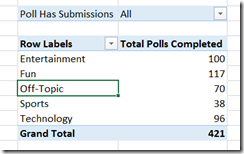
Here is the pivot table we will be using for these examples:
image

The filter is for Poll Has Submissions. We are looking at completed polls for each category.

Leaving the Filter

image

As you can see the filter remained intact while the rest of the table was converted to formulas. The primary difference is that the filter reference in the formula for CUBEVALUE is the cell that the filter shows the value in.

=CUBEVALUE(“ThisWorkbookDataModel”,$C$13,$B18,C$15)

image

This is nice if you want to use the filter format and not a slicer to enable users to filter the value. You can also map that same cell to the other values we were looking at as it returns the member value just like the slicer. Because the filter still functions as a pivot table, when you select the filter you get the Pivot Table ribbon. From here you can move the filter to the position on the worksheet you desire.

Converting the Filter

When you choose to convert the filter, it converts the filter value to the currently selected value. In the case of this example we have All selected and the ALL member is selected.

=CUBEMEMBER(“ThisWorkbookDataModel”,”[Poll].[Poll Has Submissions].[All]”)

What Does It Mean to Me?

By pulling apart an existing table that has data you want to display, you are able to move the cells around and be more creative in your dashboard design. For example, we can highlight the number of polls related to sports created by men. Then we can create an entire dashboard with other details around this without dealing with a pivot table.

image

Have fun creating more creative dashboards with these functions.

Excel BI Tip #17: Using the Timeline Filter


As I mentioned in my original post, Exploring Excel 2013 as Microsoft’s BI Client, I will be posting tips regularly about using Excel 2013 and later.  Much of the content will be a result of my daily interactions with business users and other BI devs.  In order to not forget what I learn or discover, I write it down … here.  I hope you too will discover something new you can use.  Enjoy!

Before I go much further, I wanted to call out an update to this series. I am planning to continue to cover more about Excel and Power BI components in Excel through these tips as we move forward. The focus will continue to be on Excel 2013 and beyond. So look for “sub series” around Power BI tools such as Power Pivot, Power Query, and Power Map as they are now integral parts of the Excel BI story.

Introducing the Timeline Filter

The Timeline Filter is a great visual filtering tool that can be used with pivot tables, pivot charts and data from Analysis Services and Power Pivot. It is the best way to allow users to have “range” query capabilities in Excel. It breaks down a date into Years, Quarters, Months and Days. The Timeline was first released with Excel 2013.

image

imageYou can find the Timeline filter in the same area on the ribbons as the Slicer filter or by right-clicking the fields area used with pivot tables and charts. If you have a valid date in your model, the option will be available in this area. However, if you have no valid dates, it will not be available. This is by far the most frustrating part of working with this filter. I will go through what I have discovered about getting a date that can be used with this filter in the next section.

When you can use it, Timeline filters greatly enhance the look and feel and the ease of use for Excel dashboards and analytics.

Getting a “Date” Value the Timeline Can Use

First of all, this will be the most frustrating part of working with this filter. The Timeline requires a date field, not a date dimension. This means that traditional cubes will have the least success working with this feature unless the cube design is modified. Typically, we create date dimensions that use a surrogate key that is a integer data type. Even when we choose to make this a “smart” key (e.g. 20120131 = YYYYMMDD), the value we place in the related fact tables is an integer. However, we often include an actual date as an attribute so there can be workarounds. If you are working with a cube design that has no dates typed as dates, it is likely you will be unable to use this filter.

The key point is that the Timeline must have a date value in order to be implemented. The Timeline will work with any field that is a date.

Adding a Timeline to a Pivot Table

In my example, I will be using a Power Pivot model in Excel. This is not built on a star schema, but the model has a date table that will be used in one of the demos as well. My starting pivot table will be from one table that summarizes polls by state (I am using the MyVote sample data from Modern Apps Live). As you can see in the screenshot below, it has states and the sum of submissions.

image

The next step is to add a Timeline filter. If we right-click the PollSubmissionDate field, we will see the option for adding it as a Timeline. image

image

Voila! We have a Timeline that works with our pivot table. In the next section, we will break down the parts of the filter and its options.

Timeline Parts and Options

image

The Timeline Caption and Header properties affect the same section. In our current Timeline, we have a caption of “PollSubmissionDate” which is the name of the field. This is the default when creating the Timeline. You can change the header by changing the caption. If you do not what to show the header, unselect the Header box in the options.

The other three options also allow you to hide or show features in the Timeline. By default, all of the features are showing.

The Scrollbar is located at the bottom of the Timeline. It allows users to scroll through the available dates in the filter. This is helpful when dealing with a underlying large date range.

The Selection Label is the portion that shows what has been selected in text form. In the example above, you can see that Jan-Feb 2014 has been selected and that is what is shown in the label. I find that this reinforces to the user what they have selected. If the label is not visible, then the bar under the dates is the only way to see what has been selected and that is not always clear to users.

The last option that can be turned on or off is the Time Level. This is the drop down list that shows Years, Quarters, Months, and Days. This can be used to change the granularity of the selection bar. Depending on the implementation, you may want to limit the Timeline to a particular view. However, if you are using this dynamically and the data exists to support all of those levels, then you are best served giving users the option to select the granularity of the selection bar.

The truly “cool” feature is the selection bar. Users can “grab” the edges to expand or contract the range of dates they wish to see. As they change the granularity with the time level, they are able to select days, months, quarters, or years. This truly allows for dynamic range filtering which has typically been very difficult to implement in a simple fashion in Excel.

Connecting the Filter to a Second Pivot Table

As with slicers, we can have the Timeline filter apply to multiple objects in the workbook through Report Connections. Let’s add another pivot table and try to apply the date and you will see the issue. In this example, we are adding the PollResponseCount from the PollResponse table with the ResponseDate.

image

By right-clicking the ResponseDate, I am able to confirm that it is a candidate for a Timeline filter. Let’s see if we can create a connection with our Timeline filter.

image

As you can see in our example, by adding PivotTable2 from Sheet1 we have filtered the data in the second pivot table. The data is now limited to the January and February of 2014. Of course, we should change our caption now as the filter will apply to multiple data sets and different date fields.

Post Publication Update from Chris Webb (@technitrain). There are additional limitations when using the Timeline filter with SSAS multidimensional. See Teo Lachev’s blog post on the topic.

Exploring Excel 2013 for BI Tip #15: Locking Slicer Position

As I mentioned in my original post, Exploring Excel 2013 as Microsoft’s BI Client, I will be posting tips regularly about using Excel 2013.  Much of the content will be a result of my daily interactions with business users and other BI devs.  In order to not forget what I learn or discover, I write it down … here.  I hope you too will discover something new you can use.  Enjoy!

The Issue

A picture, or in this case two pictures, are worth a thousand words. I created a pivot table from Power Pivot and then added two slicers above the pivot table. The pivot table contains a date hierarchy which can be expanded and collapsed. During this process the slicer moves around which is not optimal when you are creating a visualization in Excel such as a dashboard. Here are the screenshots which highlight the issue.

How I set it up:

image

What happens when the date gets expanded:

image

How to Fix the Slicer Position

Right click the slicer you want to keep from moving, in my case that is the second one. I first looked in the settings, but saw nothing. I stumbled onto the Size and Properties option which opened the Format Slicer slide out menu. If you expand the Properties section select “Don’t move or size with cells” option, the slicer will no longer move.

image

This is just one more way to use slicers to improve the user experience in your Excel dashboards and reports.