Excel Tip #30: Excel Services Visual Limitations – Displaying Images

As I mentioned in my original post, Exploring Excel 2013 as Microsoft’s BI Client, I will be posting tips regularly about using Excel 2013 and later.  Much of the content will be a result of my daily interactions with business users and other BI devs.  In order to not forget what I learn or discover, I write it down … here.  I hope you too will discover something new you can use.  Enjoy!

Introducing Brian Wright – Guest Blogger

Brian Wright

Today, I am happy to announce that Brian will be joining DataOnWheels as a guest blogger. I have worked with Brian over the past couple of years and his Excel visualization skills are great. I look forward to his contributions to the Excel Tips series and other BI related topics. Thanks Brian.

Hello Data on Wheels Readers! Let’s start this blog post by letting you know a few things about myself. First, I am not a professional writer, blogger, or ever social guru, but I am passionate about what I do. I love data visualization. Watching boring data come to life in a visual report or dashboard is my “thing”. Secondly, when things don’t work the way I think they should, I become obsessed in finding out a way around it.

Images Are Not Displayed in Excel Services

That is what leads us to this blog post today. In the limited environment I work within, Excel Services is used quite often in our BI suite of tools. When I realized that the ever so important images I was adding in my Excel workbooks would not show on Excel Services, my obsession kicked in.

Here is the trick or hack. (Using the word hack makes me look much cooler in my kid’s eyes). Wherever you want your picture within your workbook, simply add a chart. Yes, you read correct, simply add a chart.

clip_image002

Using Charts to Display Images

The trick here is not to link the chart to any type of data at all. Just leave it blank. Right Click on the blank chart and navigate to “Format Chart Area”. Navigate to the fill area and select “Pattern or Texture Fill”.

Next, click on the File Button and select your image. Your image will now show as a background image in your chart. Save and then voila!

clip_image004

Once Excel Services displays your workbook, you will be pleasantly surprised to see your image right where you want it!

Excel Tip #21: Hiding Scrollbars in Excel Services Web Part

As I mentioned in my original post, Exploring Excel 2013 as Microsoft’s BI Client, I will be posting tips regularly about using Excel 2013 and later.  Much of the content will be a result of my daily interactions with business users and other BI devs.  In order to not forget what I learn or discover, I write it down … here.  I hope you too will discover something new you can use.  Enjoy!

The Issue – Scrollbars in Excel Services Web Part

In SharePoint and Office365, we have the ability to add Excel dashboards we have created to our BI site. This is easily done by editing your dashboard page and adding the Excel Services web part. Here is the example I use based on the MyVote application analytics. When deployed as an entire workbook, you will see the tabs at the bottom and the vertical and horizontal scrollbars.

image

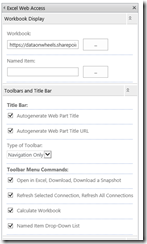
The first place to look to solve this issue is in the web part properties.

image

In the first group of settings, we can hide the toolbar. In our view there is no recognizable or relevant changes. We had navigation only turned on, but have now changed it to None. We will skip the Navigation options and check out the next two sections – Appearance and Layout.

image

Here we can adjust the size in appearance. We made this change, but the scroll bars did not go away.

So what do we do now?

Using Named Ranges

After doing a lot of searching online, I came across this option. By using Named Ranges in Excel we can hide scrollbars. While other options were sometimes brought up, the named range option has worked as expected.

Creating a Named Range

Our first step is to create a named range. Highlight the cells you want to include in your web part. In my case, I am highlighting the A1 through M39 range. Once you have the area selected, choose the FORMULAS tab and click Define Name. You can also create ranges using the Name Manager. The name manager is most helpful when modifying or removing existing ranges.

image

In the New Name dialog, specify a name. In my case I use Dashboard if only one Excel range will be used. If you plan to create more ranges for implementation throughout SharePoint, the key is remembering what you named the range. In the web part property settings, there is no look up for the ranges. You will need to get the spelling correct in order for it to be used.

image

Making the Named Range Visible

In order to make named ranges available in Excel Services, you need to change your Browser View Options. You can find the Browser View Options on the FILE menu in Excel. When you open the FILE menu, you will see Browser View Options at the bottom. This option controls how Excel operates in Excel Services on SharePoint and Office 365.

image

In the dialog you will see two tabs – Show and Parameters. For this post we are only concerned with Show. I will expand on this fully in a later blog. In our scenario, we need to change from Entire Workbook to Items in the Workbook. Then we can select the named range we created in Excel. Once you have done this, the only part of the workbook that will be visible in a web part is the named range. You will get an error unless you specify the range.

image

Once you make the change, save the workbook back to Excel.

Updating the Web Part to Use the Named Range

The next step is to update the web part to use the named range. Go back to the page we are working in and edit the web part. (Be aware if you only have one named range exposed to Excel Services, it will update the site accordingly.) In the Named Item area add the name of your named range and it will be what is shown in this web part.

image

Resetting the Size to Eliminate Remaining Scrollbars

The final step is to go into the Appearance section and updating the Height and Width settings until the scrollbars are gone.

Limitations Using Named Ranges

While this does solve a very annoying visual issue and user experience is improved, we do lose some functionality. For example, if you happen to use links in your worksheets to link to other worksheets within the workbook, these no longer work. Also, if you want to use multiple sheets on your dashboard or portal, you will need to add additional web parts or pages to support other named regions. Overall, the user experience trumps these limitations and lead to a really nice dashboard.

Here is the cleaned up dashboard view:

image

Excel Apps – Not Quite Ready for Primetime

While this is not a regular Excel tip, but it is about Excel. In my Excel BI Tips series, I am always looking for ways to build Excel dashboards or do BI work with Excel that will help everyone. In this case, I am going to discuss a new feature in Excel 2013 and Office 2013 and some of the drawbacks we discovered while trying to bring dashboards into production on SharePoint.

Excel Apps, What Is That?

With the introduction of Office 2013 and SharePoint 2013, Microsoft added the capability to create apps that can be used in the various Office applications to provide enhanced capabilities. I was most interested in the ability to bring in new visualizations in Excel that could be used for creating dashboards on my projects. One of the key advantages of using them, was that they worked when deployed to Excel Services in SharePoint without installing anything on SharePoint.

Here some examples of visualizations I planned to use.

Gauges by DataVis Design

image

People Graph by Microsoft

image

Modern Chart by Microsoft

image

Bing Maps by Microsoft

image

There are a number of other visualization options that are free or for some charge as well as other functions. You can find more of them and more information about Office Apps here.

Initial User Experience Is Poor

After getting a couple of these visualizations in a dashboard over the period of a couple of weeks were were ready to deploy the dashboards for user acceptance. Each user who opens the dashboard will have to clear the following install message from each app when they load the dashboard.

image image

While not a “big” deal for savvy users, this is really an unacceptable user experience for less savvy or less patient users. Furthermore, this could easily turn into a support nightmare as each new user is likely to call or email support regardless of the amount of instructions provided. Given that some of our audience was likely going to be executives, we determined that this would not work for us and would actually reflect poorly on our project.

Ongoing User Experience Issue

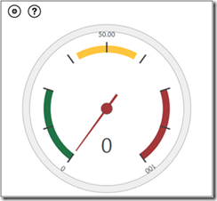
So, if you decide to move forward with these apps, you dashboard can look pretty good. However, this brings up a more long term issue. Each of the visualizations created have one or more settings buttons that remain visible, even after deployment. For instance, the gauges have a “gear” and a “question mark.” One the first requests we got from power users reviewing the dashboard was to hide them. As far as I can tell this is not possible. Next, the question was “why doesn’t the question mark contain information about the metric being displayed?” Great question, but the question mark is there to provide information about the gauge not the content. Once again, users don’t need that information. These issues reinforced our decision to remove them from our executive level dashboards and not recommend their use in other dashboards.

image

image

Concluding Thoughts

I am not sure if the problem lies in the way the apps were created or with what Microsoft has enabled in the API designs. In the end, these visualizations need to have a “deployment view” or something similar that will hide all this as well as deploy cleanly for end users. These apps do provide some cool visualizations that are not readily available elsewhere, but they need to be cleaner or more elegant for use in general dashboards deployed in SharePoint. Understanding these nuances will hopefully help you make the better decisions about dashboard design in Excel with Office Apps.

Creating a SharePoint Server Farm on Azure from the Gallery

As many of you know creating a SharePoint farm for testing can be a daunting task. I volunteered to help troubleshoot an issue that was working with SharePoint Excel Services and it couldn’t be done in Office365. So, my first attempt was to grab the SharePoint Server 2013 Trial from Azure’s VM Gallery.

image

However, once I created the VM, it turns out that SharePoint is not installed, which is what I really wanted. To complicate matters further, the download stopped because IE was blocking file downloads. You can change that setting in Internet Explorer options on the Security tab. Select the Internet Zone and click on the Custom Level button. Scroll down to the Downloads section and enable File download. Restart IE and you can get the file downloaded. Of course, we have to ask, why isn’t it already enabled on the VM since that would be the obvious goal.

As I was troubleshooting that issue, I happened to check out the Azure gallery on the Azure site and found a SharePoint Server Farm gallery image that I could use.

image

image

I clicked on the Farm icon to see what it was. It does the multi-server farm install in Azure.

You start the process by clicking the green Create Virtual Machine button in the middle of the screen. And then you are off to the configuration parts. The next few screen shots will show you the basic configuration points used during the install. Click the button… and your journey will begin.

image

This will open up the preview portal from Azure with a blade for configuring your farm.

image

Add a group name and work your way through the configuration steps on the blade. It will create 3 VMs by default unless you select the Enable high availability checkbox under the password textboxes.

image

Each configuration step will open another blade in the portal allowing you to configure the various servers to be added to the farm.

image

Once you have configured the settings you are ready to create your farm. Click the Create button and the “magic” starts to happen.

image

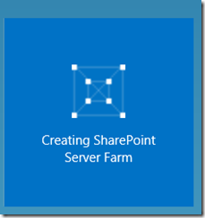
You will see the following tile added to your Startboard.

image

It took a little more than an hour to set up the three servers required – domain controller, SQL Server and SharePoint server.

image

If you click on the new tile, you will get an overview of what was created including resources and estimated spend. The next step is to log into the instance and check out what is set up. If you click the Deployment history button and then the Microsoft.SharePoint.Farm tile, you can see the SharePoint Central Admin URL and the SharePoint Site URL. Each of these blades provide additional information about your environment.

image

Log in to Central Admin or the SharePoint site. And you now have a functioning SharePoint Farm in Azure. If you are using this as a testing platform be sure to manage your VMs (e.g. shut them down) to reduce costs.

Exploring Excel 2013 for BI Tip #14: Sparklines and Pivot Tables

As I mentioned in my original post, Exploring Excel 2013 as Microsoft’s BI Client, I will be posting tips regularly about using Excel 2013.  Much of the content will be a result of my daily interactions with business users and other BI devs.  In order to not forget what I learn or discover, I write it down … here.  I hope you too will discover something new you can use.  Enjoy!

Sparklines and Dashboards

There are a lot of visualization possibilities with Excel. When creating dashboards, sparklines are a good visualization of what happened over a data series. My goal was to add sparklines to a pivot table so it could be added to a dashboard. After many failed attempts, I was able to get the following to work.

On the INSERT tab, you will find the Sparklines options. In my pivot table I am going to add Line and Column Sparkline visualizations using the MyVote submission counts.

image

Here are the steps that I used to add this visualization to my pivot table.

First, I created a pivot table with Submission Count as the measure, the rows were the Poll Categories, and the columns are the quarters of the year. Here is what the original data looks like.

image

In this case, I kept the Grand Totals for both columns and rows turned on. I am going to use these areas as the targets for the sparklines. I am going to use lines for trends over time on the Grand Total column. Then I am going to use the column visualization to show the category distribution on Grand Total row.

Adding the Line Sparkline

To add the line sparkline, select all of the data cells (no grand totals). Next, select the Line Sparkline option. This will open the Create Sparklines dialog. In the dialog, you can see the Data Range is already populated with the highlighted cells. The Location Range is empty as shown below.

image

Next, you select the columns in the Grand Total column, and that cell range will be added to the Location Range field. This will put the sparklines in those columns and they will match the data trend. For clarity, the final step would be to change the column name to “Trend” and change the font color to white so the text is not seen. Here is the result.

image

Adding the Column Sparkline

Next up, we will add the Column Sparkline. Highlight the same cells as before. Once the cells have been highlighted, select the Column Sparkline option. Select the Grand Total row for the location. This will show the distribution within the quarter for the categories. Changing the font to white does not hide the value in this case. I actually reduced the font size to 1 to make it nearly invisible. (There is no transparent font available.) Here is the result.

image

I also added lower right corner by selecting the Grand Total column cells as the data and that cell as the location to get a consistent look at distribution. One other note, the Grand Total row is called “Trend” as well because they have to have the same name. But, overall, this was the look I was working toward.

Limitations and Nuances with Sparklines

Now for the stuff that doesn’t work as you would like. Sparklines are technically not part of the pivot table. As a result, the table needs to be static in shape. This means rows and columns need to stay the same in count and position.

I am going to add a category slicer to my example. When I select the Entertainment category, all of the sparklines are “stranded” in space. Quarter 2 disappears because it has no data and as a result the trendlines are no longer in the table. This is also true for the columns as four categories are eliminated by the filter. Worse yet, if you look at the filter, you will notice we have no poll submissions in the News category. When that is added the sparklines will end up in the last data row as opposed to the Grand Total sections.

image

Sparklines are a nice tool to have, but you need to understand what is the best way to use them in the context of what you are doing.

Reference and Credit

I ran across this during my search for how sparklines work in pivot tables: http://answers.microsoft.com/en-us/office/forum/office_2010-excel/how-do-you-insert-a-sparkline-into-a-pivot-table/e072570d-b367-41f1-b2d6-2dbe939db311.  As I note with the limitations to my solution, the forum post above calls out some alternatives which allow for more dynamic approaches, but they also involve coding. Furthermore, the comment from Andrew Lavinsky (MVP) confirmed that this was possible and that it is supported in SharePoint Excel Services.