Hey there happy coders! Last weekend I had the pleasure of speaking at the SQL Saturday Atlanta event in Georgia! It was an awesome time of seeing data friends and getting to make some new friends. If you live near a SQL Saturday event and are looking for a great way to learn new things, I can’t recommend SQL Saturday’s enough. They are free and an excellent way to meet people who can help you face challenges in a new way. Below are my notes from various sessions attended as well as the materials from my own session. Enjoy!
Link to the event – https://sqlsaturday.com/2024-04-20-sqlsaturday1072/#schedule
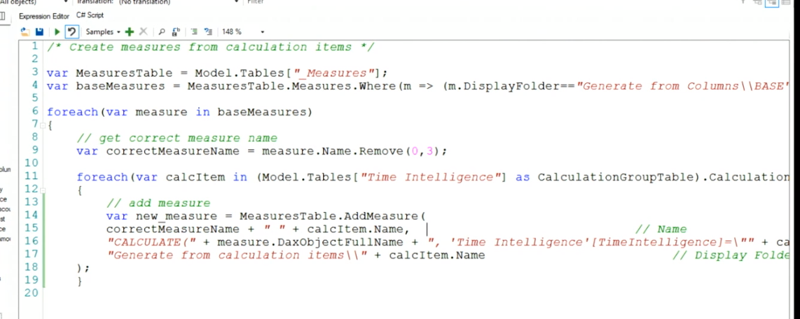
My session – Real-Time Analytics in Fabric
Thank you so much to everyone who came out to see my first ever session on Real-Time Analytics in Fabric! We had a couple of glitches in the Logic App creation, but had an excellent time troubleshooting together as a group. Please check out my GitHub for the slide deck as well as all the code used in the demonstration. Happy coding!
Link to my GitHub – https://github.com/Anytsirk12/DataOnWheels/tree/main/Real-Time%20Analytics%20in%20Fabric
Introduction to SQL Server Essential Concepts by Bradley Ball
Goal is to understand the core things about databases to enable deeper understanding.
ACID = atomicity, consistency, isolation, and durability.
Atomicity = either all of it commits or none of it commits. Consistency = my data must be in a consistent state before a transaction completes. Isolation = transaction must operate independently from other transactions. Durability = complex logging that is the transaction log. The log has all the commit history and ensures accurate data.
Transaction isolation levels – serializable, read committed (SQL server default), read uncommitted, repeatable read, snapshot isolation. You can set some of these at the db level. Serializable = blocks anything trying to get data on the same page, you can set this at the transaction level. Read committed = I can’t read data if a transaction is currently occurring. Read uncommitted = a dirty read, grabs data that isn’t committed. Repeatable read = nobody uses this lol. It’s a shared lock that holds for a longer period of time than the typical micro second. Shared lock means everyone can read the data. Snapshot isolation = Oracle and postgres use this. Every thing is an append and update. If I have 4 transactions, 1 update and 3 read, usually update would block reads, but this would redirect readers to a copy of the data in the TempDB at the point in time they requested to read it (aka before the update commits).
DMV = dynamic management view. Bradley used one that allows you to see active sessions in your database. We can see that a read query is blocked by an uncommitted transaction. We can see the wait_type = LCK_M_S and the blocking_session_id which is our uncommitted transaction. To get around this, he can run the read script and get a dirty read by setting the isolation level to read uncommitted. To unblock the original request, he can use ROLLBACK TRANSACTION to allow it to unlock that page of data.
How does SQL Server work on the inside? We have a relational engine and a storage engine. User interacts with a SNI which translates the request to the relational engine. User > SNI > Relational Engine [command parser > optimizer (if not in planned cache otherwise goes straight to storage engine) > query executer] > Storage Engine [access methods (knows where all data is) > buffer manager (checks the data cache but if not found then goes to the disk and pulls that into the buffer pool data cache). This gets extremely complicated for other processes like in-memory OLTP. The SQL OS is what orchestrates all these items.
SQL OS – pre-emptive scheduling (operating system) & cooperative pre-emptive scheduling (accumulates wait stats to identify why something is running slower).
Locks, latches, waits. Locks are like a stop light (row, page, and table escalation). If you lock a row, it will lock a page. Latches are who watches the locks/watchmen. It’s a lock for locks. Waits are cooperative scheduling. If a query takes too long, it will give up it’s place in line willingly. That creates a signal wait which signals there’s too much lined up.
SQL data hierarchy. Records are a row. Records are on a data page (8 k). Extents are 8 pages (64 k). It’s faster to read extents than pages. Allocation bit maps are 1s and 0s that signify data on a data page that enables even faster data reads – allows governing on 400 GB of data on 1 8KB page. IAM chains and allocation units allows quick navigation of pages. Every table is divided into in row data, row overflow data (larger than 8064 k), and lob data (large object like VARCHAR max and images).
Allocation units are made of 3 types:
1. IN_ROW_DATA (also known as HoBTs or Heap or B-Trees)
2. LOB_DATA (also known as LOBs or large object data)
3. ROW_OVERFLOW_DATA (also known as SLOBs, small large object data)
Heaps vs Tables. Oracle stores data as a heap which is super fast to insert. In SQL, these have bad performance due to clustered indexes and inserting new data. This is very situational. A table is either heap or clustered index, cannot be both. But heaps can have non-clustered indexes.
B-Tree allows you to get to the record with less reads by following a logic tree (think h is before j so we don’t need to read records after j). Heaps create a 100% table scan without a clustered index. Adding the clustered index dropped that significantly to only 1 read instead of the 8000 reads.
Recovery models – full, bulk logged, simple (on-prem). In the cloud everything is full by default. Full means everything is backed up. Bulk means you can’t recover the data but you can rerun the input process. Simple means you can get a snapshot but you can’t do any point in time restore. This will largely be determined by any SLAs you have.
Transaction log. This will constantly be overwritten. Your log should be at least 2.5 as large as your largest cluster. DBCC SQLPERF(logspace) will get you all the space available for logs in the various dbs. Selecting from the log is always not recommended since it creates a lock and logs are always running, so don’t do this in prod lol. Rebuilding indexes will grow your transaction log massively. To free up space in the transaction log, you have to a backup log operation which is why those are super important.
Fun tip, when creating a table you can put DEFAULT ‘some value’ at the end of a column name to provide it a default value if one is not provided. Pretty cool.
You can use file group or piecemeal restores to restore hot data much faster then go back and restore older, cold data afterward. To restore, you must have zero locks on the db. While restoring, the database is not online. Note, if you do a file group restore, you cannot query data that is in a unrestored file group so queries like SELECT * will not work.
Tales from the field has a ton of YouTube videos on these subjects as well.
Lessons Learned using Fabric Data Factory dataflow by Belinda Allen
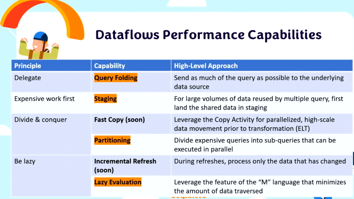
What are dataflows? Dataflows are a low-code interface tool for ingesting data from hundreds of data sources, transforming your data using 300+ data transformations. The goal is to allow for more people to manipulate and use data within your organization. At the heart, it’s Power Query.
Why start with dataflows as a citizen developer? It’s power query and you know that. It’s low-code data transformation. Excellent for migrating Power BI reports to Fabric.
Lots of great discussion about when it makes sense to use a dataflow gen2.
You can copy and paste power query from Power BI by going into the advanced editor OR you can hold shift and select all the queries you want then ctrl c then go to power query for a dataflow gen2 in the online service and hit ctrl v and it will populate with all your tables! Pretty neat. You can also make your relationships within the online portal.
DBA Back to Basics: Getting Started with Performance Tuning by John Sterrett
For the code visit: https://johnsterrett.com/blog-series/sql-server-performance-root-cause-analysis/
Goal of today’s session – arm anyone who is new to performance tuning with processes and sills to solve common problems.
Basic query runtime. SQL has something called wait stats that tells you what caused the query to be slow. When you run a massive query, it will go into a suspended state which will require reading from disc instead of from memory cache (T1). After that, you’re in a runable state (T2). Finally, you get to run it (T3).
Basic bottlenecks = memory, disk, CPU, network, locking blocking & deadlocks. Adding memory is typically the fastest way to improve performance.
Identify performance problems happening right now:
EXEC sp_whoisactive. This is an open source script that gives you insight into who’s running what right now. You can get this from https://whoisactive.com. The cool thing about this is there are more ways to run it than just EXEC sp_whoisactive. Identify what’s consuming the most CPU from the column. There’s also some parameters you can use like @sort_order. EXEC sp_whoIsActive @sort_order = ‘[CPU] DESC’, @get_task_info = 2. The task info parameter will give more information in a wait_info column. The best command is exec sp_whoIsActive @help = 1. This provides ALL the documentation on what it does. Adam (the creator) also has a 30 day blog series on everything it can do for you! One option to make things run faster is to kill the process causing the issue lol.
How to handle blocking. You can do explicit transactions with BEGIN TRANSACTION which will lock the table. At the end, you need to either COMMIT or ROLLBACK or else that lock holds. SQL uses pessimistic locking as default so it won’t let you read data that’s locked – it will simply wait and spin until that lock is removed. You can use exec sp_whoisactive @get_plans = 1 to get the execution plan. Be careful, the wait_info can be deceptive since the thing that takes the most time may not be the problem. It may be blocked by something else, check the blocking_session_id to ve sure. Also check the status and open_tran_count to see if something is sleeping and not committed. Keep in mind that the sql_text will only show you the last thing that ran in that session. SO if you run a select in the same session (query window) as the original update script, it won’t be blocked and can run and THAT query will show up in the who is active which can be super confusing. To resolve this issue, you can use ROLLBACK in that session to drop that UPDATE statement.
To find blocking queries use EXEC sp_whoIsActive @find_block_leaders = 1, @sort_order = ‘[blocked_session_count] DESC’.
Identifying top offenders over the long term:
There’s a feature in SQL 2016 forward called Query Store which persists data for you even after you restart data. It’s essentially a black box for SQL. Query Store is on by default in SQL 2022 and online servers. It’s available for express edition as well. Be sure to triple check this is on, because if you migrated servers it will keep the original settings from the old server. If you right click on the DB, you can navigate to query store and turn it on via Operation Mode (Requested) to Read write. Out of the box is pretty good, but you can adjust how often it refreshes and for how much history. To see if it’s enabled, you should see Query Store as a folder under the db in SSMS.
Under query store, you can select Top Resource Consuming queries. There’s lots of configuration options including time interval and what metric. SQL Server 2017 and newer have a Query Wait Statistics report as well to see what was causing pain. It’ll show you what queries were running in the blocking session. You won’t get who ran the query from query store, but you can write sp_whoisactive to a table that automatically loops (very cool). This will have overhead on top of your db, so be mindful of that.
Intro to execution plans:
Keep in mind, SQL’s goal is to get you a “good enough” plan, not necessarily the best plan. Follow the thick lines. That’s where things are happening. Cost will tell you the percentage of the total time taken.
Key lookups. It’s a fancy way to say you have an index, so we can skip the table and go straight to the data you have indexed. BUT if there’s a nest loop, then there’s an additional columns in the select statement so it’s doing that key lookup for every value. More indexes can make your select statements worse if it’s using the wrong index that isn’t best for your query.
Index tuning process.
1. Identify tables in query
2. Identify columns being selected
3. Identify filters (JOIN and WHERE)
4. Find total rows for each table in the query
5. Find selectivity (rows with filter/table rows)
6. Enable statistics io, time, and the actual execution plan
7. Run the query and document your findings
8. Review existed indexes for filters and columns selected
9. Add index for lowest selectivity adding the selected columns as included columns
10. Run the query again and document findings
11. Compare findings with baseline (step 7)
12. Repeat last 5 steps as needed
To see existing indexes, you can run sp_help ‘tableName’. In the example, there’s an index key on OnlineSalesKey but that field is not used in our filter context (joins and where statements) in the query. Order of fields in indexes do matter because it looks in that order.
Brent Ozar made a SP you can use called sp_blitzIndex that will give you a ton of info on an index for a table including stats, usage, and compression. It also includes Create TSQL and Drop TSQL for that index to alter the table.
To turn on stats, use SET STATISTICS IO, TIME ON at the beginning of the query. Be sure to also include the actual execution plan (estimated doesn’t always match what actually happened). Now we can benchmark. Use SET STATISTICS IO OFF and SET STATISTICS TIME OFF. Create an non clustered index with our filter context columns.