Before I get too far in the weeds, I have to recognize Rob Collie, his blog (http://www.powerpivotpro.com) and his book DAX Formulas for PowerPivot: The Excel Pro’s Guide to Mastering DAX. His book has been a great resource as I work through fun with DAX. I used information from his post on Dynamic TopN Reports via Slicers, Part 2 to solve my problem which I will describe next. Thanks for the info Rob!
The problem I was trying to solve was creating a top 10 chart in Power View that showed the top 10 in context of what was filtered in the Power View report. If you click a pie slice in a chart, filter the top 10 at the same time. Also have it work with slicers. I was working with Power View and a couple other BI tools to see if this was possible. All tools are able to handle creating a calculation that will show the top 10 for a set of criteria, however, when the data was dynamically filtered on the page, only top 10 values that from the original measure that also worked in the filter worked. So, now my top 10 charts would have fewer than 10 results.
I will walk through the process so you can see both ways and how I got to the eventual solution.
Both solutions use the RANKX function in Power Pivot. So let’s start their. I am using my Poll solution from the My Vote application built for Modern Apps Live. We have a Poll Response Count calculated measure:
Poll Response Count:=COUNTA([PollResponseID])
Using that as the starting measure we add the ability to get the top 10 responses by Poll. On the Poll table, which is joined to the Poll Response table by Poll ID, I added the following calculation to give rank values to the Polls.
Poll Response Rank:=RANKX(ALL(‘Poll’),[Poll Response Count])
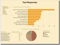
This applies a rank value in ascending order to the Polls by Response Count. Let’s apply this to a Power View report. In my report, I will be adding a Slicer on Category Name (all Polls belong to a Category), a bar chart with Response Count by Poll Question, a Pie Chart with Response Count by Category, and a table which shows the raw rank value for each question. Here is what that looks like:

In order to get the top responses in the bar chart we need to add Poll Response Rank to the Chart Filter (Not the view filter) for the bar chart. As you can see below, we pick the responses less than or equal to ten.

This applies the top 10 filter only to the chart which is what we want. However, when I filter by Off-Topic only two values remain in the chart. When you look at the table values ranked less than 10 overall will not be included in the chart. In some cases this is exactly the functionality you want. Here is what the filtered view looks like, only two of the 4 show up in the bar chart.

What if I wanted the slicer to also apply to the bar chart. We need to use a slightly different formula.
Poll Response Filtered Rank:=RANKX(ALLSELECTED(‘Poll’),[Poll Response Count])
By changing the chart filter to the new rank value you will see we get the filter applied based on the selections in the sheet.

How Does It Work?
The key is what I learned from Rob’s writings and samples. The ALL() function removes external context when applying a function. So ALL in this case will return the full set of Polls and then apply the RANKX function. So, it is returning the rank for all polls. ALLSELECTED() applies the RANKX function to the currently selected values. So any operation within a Power View sheet which changes the filter context, such as a slicer, will reset the Polls to only the set of Polls which have been selected and then apply the ranking.
If you do not use ALL or ALLSELECTED, the context is the row and will always return 1. Which is not helpful.
Can We Reverse the Order?
If you need to show the bottom ranking, you can add to the RANKX function. RANKX syntax:
RANKX(<table>,<expression>[,<value> [,<order>] [, <ties>]]])
Value, Order, and Ties are optional parameters. The one that matters is the Order parameter. The Order can be 0 or 1 and it defaults to 0. 0 ranks the values in descending order. To get the bottom result, you would use 1 here. The following code shows how we would rank the bottom polls.
Poll Response Filtered Rank:=RANKX(ALLSELECTED(‘Poll’),[Poll Response Count],,1)
For the optional parameters, you only need to leave a placeholder if you do not need it. Why create a separate value for reverse order? Because Power View can easily handle less than 10, but not the last 10. By making the change above and not changing our standard rank you can see that the data is now filtering for the bottom ten based on how the ranking value is assigned.

I hope this helps you create even more effective visualizations with just a bit more DAX under your belt.


 A little over six months ago, I wrote an article on Magenic.com about
 ![powerpivotprotoday[1] powerpivotprotoday[1]](https://i0.wp.com/www.powerpivotpro.com/wp-content/uploads/2010/06/powerpivotprotoday1_thumb1.png)
