Power BI: Creating an Info Button with UNICHAR()

Reports are only as useful as they are easily understandable. When making reports for executives and other business leaders, it is vital to ensure the context and insights of the report are easy to understand at a glance. As cultivators of data, we have a responsibility to make sure it is used and interpreted correctly otherwise data can quickly be used to come to incorrect conclusions. When users don’t understand data, they often distrust any data-driven decisions and go back to using instinct to make important business decisions.

While it’s important to give context to reports, the method of doing so may seem cumbersome. Some options include explaining the report to every new user or taking up valuable report space with explanations and contexts. For end user experience, it’s often best to replicate something they are already familiar with like a webpage. Many websites contain options for giving additional details to curious end users, typically they signal these resources with an “i” or information icon. We can replicate that functionality in Power BI by using UNICHAR characters and a hidden page.

The steps below will walk through how to add an information icon to the report, making a tooltip page containing your additional information, and enabling the tooltip to allow users to hover over the icon and see the information.

1. Make the following measure in your measures table:
Info Button = UNICHAR(128712)

2. Create a card visual and add this measure to it. You’ll see the following icon:

3. Create an additional page with a text box containing your additional information.

4. Hide this information page and configure it to be used as a tooltip. You may also want to resize it so that when users view it as a tooltip on the info icon it will cover the entire report. To hide the page, right click on the page name and select “Hide Page”. To get to the page configurations, you’ll need to select a blank section of the page (this avoids any visual configuration settings) and select the format paint brush. For resizing, I recommend setting it as a custom type then adjusting your pixels until it nearly fits your text box. Note: it will automatically align top left, so it’s best to align your text box to top left so as you resize you don’t lose your text box.

5. Add this info page as a tooltip for the card visual containing the info button. To do this, you’ll need to select your card visual, go to the format pane, and turn tooltips on. Once tooltips are on, you can select the type of report page then select the page that you made earlier with your additional information.

Now when you hover over the icon, the tooltip will display your additional information. In the example below, I’ll mess with the pixels more on the info page until it’s the appropriate size for the amount of information I want to convey.

And that’s all there is to it! One valid alternative to this is to make a bookmark that would lead end users to the information page. Personally, I prefer this tooltip method so end users do not lose their place within the report and it is small enough to be put on every page of the report.

Feel free to check out the PBIX used for this blog post in the Data On Wheels GitHub Repo.

Power BI DAX Getting the Value of Previous Non-NULL Row

If you are an avid report designer or user, you may have wanted to see the percent difference between one row and the previous one. Sounds easy right? Well let’s break it down. Percent difference follows a consistent formula: (current value – previous value)/previous value. Current value? Easy peasy. Previous value? That’s where this blog comes into play. It’s fairly simple to get the previous month value or previous date period value because Power BI can tell it exactly what the filter would be (September minus one month is always August ). However, there may not have been any invoices in August, so how can we compare September with the last month that had an invoice?

Let’s set the scene for this example. A business user has requested to compare each day’s orders with the previous day they had orders. To get the previous day that had orders, we can create a measure called Last Day Order Quantity (see below). Within this measure, you’ll notice we use a variable to calculate the measure Order Quantity. By pulling this into the variable, it will save the row context for Order Quantity so we can make sure that we are only looking at rows that have orders. The next variable (LastDayOrdered) filters the ship date table to grab the last date where 1. there are orders (Order Quantity is not blank) and 2. the current day (aka the row we are currently on) also has orders. The final variable does the work of calculating our order quantity for the last day that contained orders.

Last Day Order Quantity = 
VAR Orders = [Order Quantity] //grab the charge amount for this line
VAR LastDayOrdered = MINX(FILTER(ALL('ShipDate'),'ShipDate'[DaysAgo]>MAX('ShipDate'[DaysAgo]) &&[Order Quantity] <> BLANK() && Orders<>BLANK()),'ShipDate'[DaysAgo])
VAR LastDayOrders = CALCULATE([Order Quantity],FILTER(ALL('ShipDate'),'ShipDate'[DaysAgo]=LastDayOrdered))
RETURN  
LastDayOrders

As you can see in the screenshot above, there is a gap in ship dates between 1/25/2014 and 1/28/2014 and the last day order quantity pulls in the amount from 1/25/2014 (1) instead of grabbing it from 1/27/2014 (0). Sweet! Now that makes finding the % difference in order quantity very simple. Below is the full code from this example and also a more parameterized version with tons of comments to help you use it as needed. Happy coding!

Final Measure:

% Difference Order Quantity = 
VAR Orders = [Order Quantity] //grab the charge amount for this line
VAR LastDayOrdered = MINX(FILTER(ALL('ShipDate'),'ShipDate'[DaysAgo]>MAX('ShipDate'[DaysAgo]) &&[Order Quantity] <> BLANK() && Orders<>BLANK()),'ShipDate'[DaysAgo])
VAR LastDayOrders = CALCULATE([Order Quantity],FILTER(ALL('ShipDate'),'ShipDate'[DaysAgo]=LastDayOrdered))
RETURN  
DIVIDE(Orders-LastDayOrders,LastDayOrders,0)

Commented version:

% Difference = 
//Make a variable to grab the value of your measure at your current line (we will use this later)
VAR Desired_Measure = [Order Quantity]

//Now we need to grab the time where this desired measure was not null
//In my example, ship date is the column that I want to see the previous order quantity sliced by
VAR Last_Time_Measure_Had_Value = 
    // I use MINX here to ensure I get the previous day, not the next day. Feel free to flip this as desired.
    MINX(FILTER(ALL('ShipDate') 
        //this makes sure that I'm only grabbing ship dates that are before my current ship date.
        ,'ShipDate'[DaysAgo] > MAX('ShipDate'[DaysAgo])
        //this makes sure that the options for days ago only include ones that we had orders on, AKA the desired measure is not NULL for this day. 
        //DO NOT USE Desired_Measure here because desired_measure will only look at your current row and we are trying to look at all the rows to make sure we are grabbing a non-NULL one. 
        &&[Order Quantity] <> BLANK() 
        //this checks that the current row is not blank. 
        && Desired_Measure<>BLANK())
    //I need this variable to return the smallest number of days ago (hence the MINX at the beginning) that meets the criteria above
    //For your use, you should swap daysago with whatever field you are hoping to slice and dice by
    ,'ShipDate'[DaysAgo])

//This final variable calulcates my desired measure (order quantity) and filters my table for the last time that measure had a value.
VAR Last_Instance_Of_Calculated_Measure = CALCULATE([Order Quantity],FILTER(ALL('ShipDate'),'ShipDate'[DaysAgo]=Last_Time_Measure_Had_Value))

//Easy peasy now! We can take our current days orders - last day we had orders number of orders, divded by the last day we had orders number of orders to get the % growth day over day. Phewf!
RETURN  
DIVIDE(Desired_Measure - Last_Instance_Of_Calculated_Measure,Last_Instance_Of_Calculated_Measure,0)

Power BI DAX Dynamic Measures

Dynamic measures are an effective way to avoid crowding your report with different versions of the same visual without using bookmarks. No disrespect to the versatility of bookmarks, but they can quickly clog up reports with the amount of visuals used and can be a headache to modify depending on the complexity. This post will explore when to use dynamic measures, how to set up your data model to accommodate them, how to implement them, and limitations.

A primary use case for dynamic measures is when you have multiple business owners looking at a report who each want to see the report in slightly different ways.

For example, you may have three major stakeholders looking at a report: CEO, CFO, and COO. The CEO may be more interested in future profits and looks at trends in the number of loads booked to see where we are headed. The CFO wants to see profit trends on loads that have already been completed (actualized profit). Additionally, the COO would rather see what’s currently in transit and look at only picked up loads. You could make three pages, one based on booked loads for the CEO, another based on delivered loads for the CFO, and one based on picked up loads for the COO. But what happens if your report is already going to be multiple pages and needs room to grow? You would need to triple your page count to accommodate the needs of your users or build three completely separate reports! Don’t worry, dynamic measures can solve this problem for you without clogging up your reports or workspaces with extra measures, visuals, and reports.

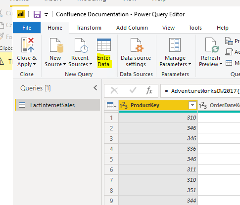
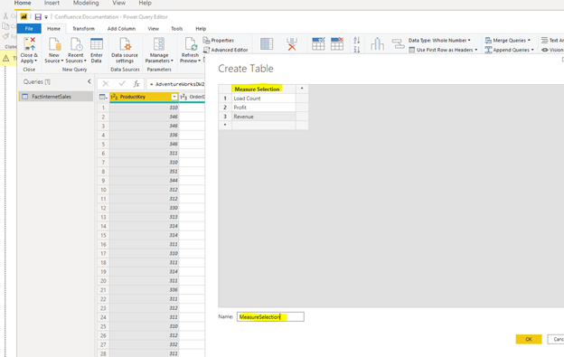
In order to use dynamic measures, you will need to set up your data model with some tables for the singular purpose of selecting the dynamic measure. You will also need to have a few measures that will correspond with those filters. For example, if you are want the end users to choose between seeing load count, profit, and revenue, you will need to make a table that contains all three of those fields as rows. The easiest way to do this is to go into the Power Query editor and use the “Enter Data” option. Make sure that your options are exactly as you’d like them displayed for your end users and are in a table that’s easy to reference.

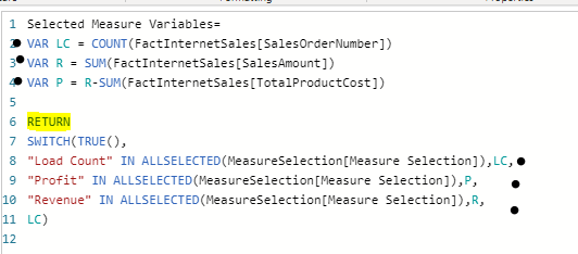
Hit close and apply. Once your new table is loaded, you DO NOT need to connect it to your other data in the data model. Dynamic measures work because they do not rely on relationships between the filter and the data, but on the selection of measures to be used. You have a couple options here, you can build each of these measures separately or build them once within the dynamic measure itself. There are reasons to do both, so we will build out both examples. Having separate measures offers you lots of flexibility down the road, but if you are only using these measures within the dynamic measure then it’s best to keep it all within the dynamic measure to save some space and increase efficiency in your DAX queries.

Building the Dynamic Measure

After you have your desired measures built out, you can reference them inside your dynamic measure either by using separate measures or variables. The key expression in dynamic measures is an IN ALLSELECTED combination. It’s vital to know exactly how your options were spelled inside your recently make custom table because you will need to spell them out within the dynamic measure. The basic syntax is as follows:
Selected Measure =
SWITCH(TRUE(),
“Option1” IN ALLSELECTED(CustomTable[ColumnName]),[Option1Measure],
“Option2” IN ALLSELECTED(CustomTable[ColumnName]),[Option2Measure],
“Option3” IN ALLSELECTED(CustomTable[ColumnName]),[Option3Measure],[DefaultMeasure])

If your dynamic measure is being used to filter a selected field instead of choosing a completely different metric, I recommend using a variation of the following syntax:
Selected Measure =
VAR A =
SWITCH(TRUE(),
“Option1” IN ALLSELECTED(CustomTable[ColumnName]),[Filter1],
“Option2” IN ALLSELECTED(CustomTable[ColumnName]),[Filter2],
“Option3” IN ALLSELECTED(CustomTable[ColumnName]),[Filter3],[DefaultFilter])
RETURN
CALCULATE([Measure],FILTER(Table,Table[FilteredColumn]=A)

Using separate measures:

Using variables:

Using the switch function in conjunction with the IN ALLSELECTED allows the end user to “switch” their selection with the measure associated with it.

Using the Dynamic Measure

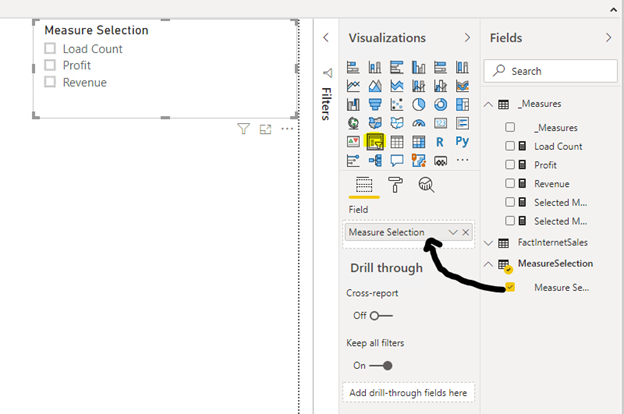
To use a dynamic measure, you’ll need to first build a slicer with your custom table you made earlier and referenced inside your dynamic measure.

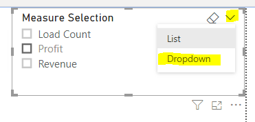
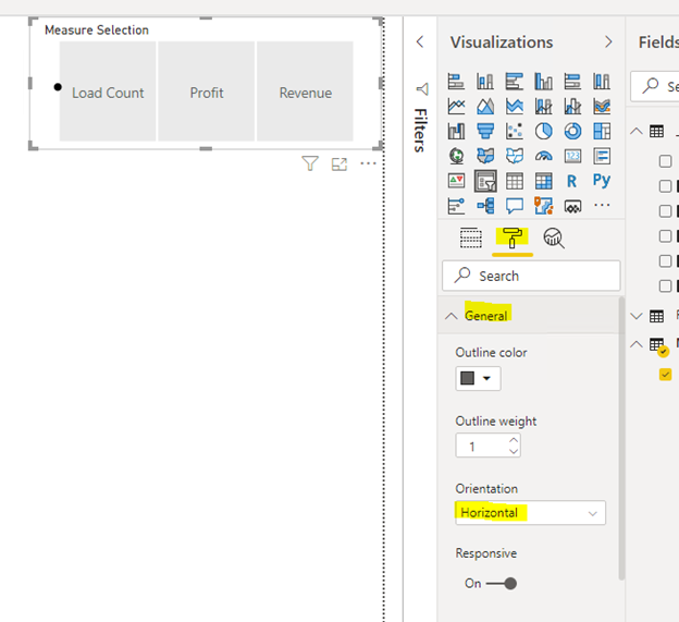
Depending on how many options you have, it may be wise to format this slicer as a drop down or as a horizontal list to make it appear more like buttons.

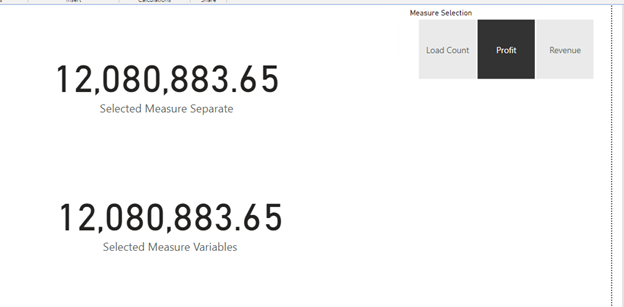
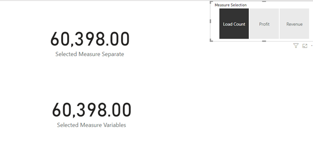
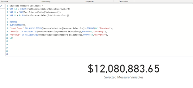
To test your dynamic measures, let’s throw it into a card visual then select a couple different options to make sure it’s choosing the correct measure.

Perfect, working like a charm! From here, any visuals you build using these dynamic measures will adjust when users select their metric. Be sure to carefully label your visuals so it’s clear that what they are looking at will change depending on what they have selected. If you would like to have your profit and revenue to have ($) signs in front of the metrics, just build that formatting into the measure itself using FORMAT. In the example below, format is used to set profit and revenue as currency while load count is a standard number (comma separated). For more formatting options see the following documentation from Microsoft: https://docs.microsoft.com/en-us/dax/pre-defined-numeric-formats-for-the-format-function.

Now when you go to build your report, instead of 3 duplicate pages use this dynamic measure in all your visuals and place the slicer at the top of the page for various users to interact with at will.

Check Out Josh’s Blog on Creating Percentile in DAX

I would like to introduce a “new” blogger to you. Joshuha Owen has restarted his blog and will be covering topics on business intelligence and data. I have worked with Josh for years at a Magenic and now Pragmatic Works. I look forward to seeing what he will be writing about in the future as well on Bits, Bytes, and Words.

Here is his most current post. Enjoy!

Replicating Excel Percentile in DAX

Currently, DAX has no native percentile function so if you want to replicate a version that matches what the Excel Percentile.INC (inclusive) function does you have to jump through a few hoops. This will involve having to create several measures to hold some intermediate values to apply a final formula. In theory you could do it all in one DAX expression but it would very difficult to read and test.

Continue reading…

Power Testing ETL with Power BI – Creating the Tests with Power Pivot

PowerTool_1This is the second deep dive into Power Testing ETL with Power BI. At this point, we have created the source table which will be used in our testing. The next step is to bring in the destination table and create the tests that will be “run” against the data. In its simplest form the tests are created using logical conditions based on whether source data matches destination data and calculations applied to those data sets also match. When they don’t match, you have data load error which results in a failed test.

How to Calculate Success and Failure

The basics of the testing is turn the results into numbers and calculate if and how much we succeeded or failed. Typically, every test will result in a 1 or 0. Whether you assign 1 to success or failure is largely dependent on how you plan to display your results. If you plan to use KPIs built into the Power Pivot model, you will be comparing the number of successful tests against the number of rows expected to be imported. The primary reason for this is that you cannot target zero when using KPIs. In this scenario, successful tests result in 1 and are therefore easily compared to the number of expected rows which would be 100% successful if they matched.

The other scenario is to measure failures. In this case, we assign 1 to each failed test and count the number of failed tests. This can easily be handled in visualizations such as conditional formatting where 0 can be displayed as green and the number of failures change the state from from green to yellow then red. This helps identify the most commonly failed tests.

The method you choose is up to you and how you prefer to see the results. We will cover using both variations in visualizations, but for sake of brevity here, we will measure success against our row count. Success = 1; Failure = 0.

Creating the Power Pivot Tests

In order to create the tests, you need to open the Power Pivot window and add the destination table to the model. In our case we have created a table in the HughesMediaLibrary database called books that is our target. Here is the syntax for the target table.

CREATE TABLE dbo.Books(
BookID int IDENTITY(1,1) NOT NULL
CONSTRAINT pk_Books PRIMARY KEY CLUSTERED,
BookName varchar(100) NOT NULL,
Publisher varchar(100) NULL,
Genre varchar(50) NULL,
CopyrightYear smallint NULL,
AuthorFName1 varchar(100) NULL,
AuthorLName1 varchar(100) NULL,
AuthorFName2 varchar(100) NULL,
AuthorLName2 varchar(100) NULL,
AuthorFName3 varchar(100) NULL,
AuthorLName3 varchar(100) NULL,
AuthorFName4 varchar(100) NULL,
AuthorLName4 varchar(100) NULL,
AuthorFName5 varchar(100) NULL,
AuthorLName5 varchar(100) NULL,
PageCount int NULL
)

While I realize this is not a good normalized table, it serves our purposes well to build out the tests. This table needs to be added to the Power Pivot model before we can do the next steps.

Relating the Source and Destination

The next step is to relate the source and destination. In our case, the only data that will work is the book name. We will use the Source table as the primary table in this relationship. The idea is that all the data in the source table should exist in the target. As this is not always the case, the source is the “source of truth” for the testing scenario.


Building the Tests

The tests are comprised of calculated columns that handle data analysis and calculated measures which summarize results.

Validating Data Field by Field,  Row by Row

This is the primary reason that we worked with Power BI. One of the most common testing scenarios is whether the data came over correctly. In the previous post, we shaped the data with Power Query. Now we will compare it with the results from our ETL process in SSIS. We will use Book Name as the example. Every field you wish to test can follow this pattern. The test consists of a calculated column and a calculated measure.

We create a column in the destination table called Book Name Matches. (Remember we are tracking success not failures.) In each row of the data we need determine that the book name in the destination is the exact match for the book name in our source. We used the following DAX for that calculation:

=IF(RELATED(‘Booklist Source Fixes'[BookName])=’Media Library – Books'[BookName],1,0)

It looks at the related table to determine that the field names match. If they match, the test is assigned a 1 for that row. If they do not match, a 0 is assigned. (The table names are how I named the source and destination. They may not match your solution if you are following along.) Once we have the rows evaluated, we will sum the values with a Book Name Matches measure:

Book Name Matches (34):=SUM([Book Name Mismatch])

We will use the Book Name Matches (34) measure to compare with the book count. If they match, all tests passed. If they do not, then some or all rows have failed.

The number after the measure, 34, is the test key from TFS. I added this into the measure to make it easier to identify which test case is being evaluated with this measure. In some cases, you may have multiple measures that are required to complete a test. You can either evaluate them independently or create and additional measure that summarizes them for your use.

Other Validations or Tests

Some other basic validations can be created as well. A common one would the book count. In my scenario, I return the book count then evaluate it using a KPI. Another way to do this is to add another measure that checks for equality between the two book count measures in the source and destination. If they match, success. If not, failure.

You can also use measures to validate expected totals the same way we were working with counts. This is particularly helpful in financial data loads where you would want to verify a sum of balances to make sure the results match. The point is that you can add any other measures that you want to compare in order to meet the unique needs of your situation. It is also possible that you can compare to entered values. If you know that 100 widgets are to be imported, you can have the measure evaluate against 100 instead of  a measure in the source.

Recording the Results in TFS

In order to bring the process full circle, we enter test results into TFS or Visual Studio Online. This allows us the ability to track test results, bugs, and fixes in a development lifecycle tool. It is also the best way to track testing history. One caveat here is that the query results from TFS do not permit you to set test results in Excel. Ideally, we should be able to link in the tests with the results. We could then update the results in the query and push it back. This is NOT supported at the moment. As a result, you will need to open the tests in TFS to update your results. This is not a significant issue because you should also create bugs for failed tests. It’s primarily a nuisance.

An added side effect of using this method to test is that we are able to collaborate with developers to determine what the bug actually is. Because all the data is loaded into Excel reviewing results is fairly simple and may actually be easier than trying to look at the destination system.

Quick Look at SSIS

Up to this point, we have focused on how an non-developer can set up the source and destination and proceed to test. I wanted to call out the author name work done in Power Query to highlight why Power BI is a great choice. When splitting author names, the work was done using right-click operations. Here is an example of the expression code used to split out the second author name column:

(DT_STR,200,1252)TRIM((FINDSTRING(AuthorNames,”,”,1) == 0 ? NULL(DT_WSTR,200) : TRIM(SUBSTRING(AuthorNames,FINDSTRING(AuthorNames,”,”,1) + 1,FINDSTRING(AuthorNames,”,”,2) == 0 ? LEN(AuthorNames) : 1 + LEN(AuthorNames) – FINDSTRING(AuthorNames,”,”,2)))))

Compared to Power Query, this is complex and not intuitive. While Power Query is not intended for enterprise ETL use, it’s simplicity helps test complex scenarios such as our author name split without having to create and equally complex SQL statement or expression.

The next post will take a look at some of the visualization options for the test results.