Ever since Excel made its debut in the 1980’s, it has been used as a quick way for end users to input and manipulate data on their own without going through the extensive data engineering and data ingestion processes. With Power BI coming on to the scene in 2015, it quickly became the go-to visualization tool for various data sources. These two powerful tools can be used together to drive customized insights for your organization. By uploading your Excel file into SharePoint/OneDrive, you can easily connect and set up a refresh to a Power BI report in the Power BI Service without an on-premises gateway.
The benefit of this method is that you can continue to update the Excel workbook from SharePoint/OneDrive and Power BI will pick up those data updates whenever the semantic model is refreshed. Another benefit to this method is that your laptop doesn’t need to be on for the refresh to work. If you have the Excel file on your machine and decide to use a gateway, the only way your refresh will work is if the computer that has the gateway installed is on. Also, by moving your Excel file to the Cloud, you get the benefit of easy sharing, automatic backups, and the ability to edit your file from any computer.
Alright, so now that I’ve sold you on storing your files more securely in the cloud, let’s discuss connecting to that data in Power BI desktop. Because the file is no longer on your machine, we can’t use the Excel workbook connector. Instead, we are going to use the web connector. But first, let’s start by opening our Excel file from OneDrive. There are two options for this, the first is to sync your OneDrive to your computer (highly recommend this option) and the second is to open the Excel file in your browser then navigate to open it in your desktop. If you’d like to sync your OneDrive to your laptop, go to the Settings gear in the upper right-hand corner and select “Sync this OneDrive”.
Now we can open the file in the Excel desktop app! Once you open the Excel file on your desktop, navigate to the File tab and go down to the Info section. Select the Copy Path button.
Alrighty now let’s get back to Power BI. In Power BI, select Get Data drop down in the top ribbon and click on Web.
Paste in the link we copied from Excel and delete the “?web=1” at the end of the URL.
And boom that’s it! Now you can choose what datasheets and/or tables from that Excel workbook you’d like to include in your report!
Okay I lied, one more step but it’s easy I promise. Once you publish your report to the online portal, you’ll need to set up the refresh. To set up the refresh, navigate to the workspace and select the three dots next to the semantic model you published. From there, navigate to the Settings page.
Now for the actual last step, select the Data source credentials drop down and select Edit Credentials. Finally, click on Sign In and sign in using your OneDrive credentials. And boom that’s it! Nice work!
It was awesome to see the Kentucky data community come out for the first Derby City Data Days in Louisville, KY! Bringing together communities from Ohio, Tennessee, and Kentucky, the Derby City Data Days event was an excellent follow-up to Data Tune in March and deepened relationships and networks made at the Nashville event. In case you missed it, below are my notes from the sessions I attended as well as the resources for my session. Be sure to check out these speakers if you see them speaking at a conference near you!
Building Self-Service Data Models in Power BI by John Ecken
What and why: we need to get out of the way of business insights. If you try to build one size fits all, it fits none. Make sure you keep your data models simple and streamlined.
Security is paramount to a self-service data model. RLS is a great option so folks only see their own data. You can provide access to the underlying data model for read and build which enables them to create their own reports off the data they have access to. If you give your user contributor access, then RLS will go away for that user. Keep in mind, business users need pro license OR need to be in a premium workspace.
One really great option is for people to use the analyze in Excel option to interact with the most popular BI tool – Excel. This allows them to build pivot tables that can refresh whenever needed. You can also directly connect to Power BI datasets from their organization! You can set up the display field option as well to get information about the record you connect to. Pretty slick! With this, security still applies from RLS which is awesome.
Data modeling basics – clean up your model by hiding or removing unnecessary columns (ie sorting columns). Relationships matter. Configure your data types intentionally. Appropriate naming is vital to business user success. Keep in mind where to do your transformations – SQL vs DAX (think Roche’s Maxum). Be sure to default your aggregations logically as well (year shouldn’t be summed up).
Power BI Measures – creations, quick create, measure context, time-based functions. Whenever possible, make explicit measures (using DAX) and hide the column that it was created off of so people utilize the measure you intended. Make sure you add descriptions, synonyms (for Copilot and QA), featured tables, and folders of measures. The functionality of featured tables makes it wise to use folders of measures within your fact tables.
John likes to use LOOKUP to pull dims back into the fact table so he ends up with as few tables as possible. There are drawbacks to this such as slower performance and model bloat, but the goal is for end users who don’t have data modeling experience or understanding. Not sure I agree with this method since it’s not scalable at all and destroys the purpose of a data model. Make sure you hide columns you don’t want end users to interact with.
To turn on feature table, go to the model view then go to Properties pane and toggle that is featured table button. It will require a description, the label that will populate, and the key column (cannot be hidden) that the user will put in excel as a reference for the business user to call records off of.
Be sure to look at his GitHub for the awesome source code!
Come to Lousiville on May 9th to see a presentation on JSON and TSQL.
The goal of this is to avoid FULL OUTER JOINs. This is extremely unscalable since maintenance would be terrible. We will avoid this by using pivot. Pivot means less rows, more columns. PIVOT promotes data to column headers.
You get to decide how the tuple that’s created on the pivot is aggregated (count, min, max, sum, avg, etc.). Exactly one aggregate can be applied, one column can be aggregates, and one columns values can be promoted into the column header.
PIVOT ( SUM(Col1) FOR [ID] IN ([ID_value_1], [ID_value_2], etc.) SUM = the aggregate, ID = the column that will become more columns, the IN values = the column values from ID that will be promoted into the column header.
Time for a 3 column pivot. For this, we are doing a two column pivot and ignoring one of the fields. You can even pivot on computed fields but make sure you include the values in that inclusion clause. Be careful about adding unnecessary data.
How do you manage the VTCs (the column values that end up as column headers)? Option 1 – don’t. Option 2 – explicitly request the ones of interest and provision for future extras. Option 3 – use dynamic SQL! You can use cursor, XML, etc. Check out his ppt deck from github for code samples!
An n-column PIVOT works by essentially creating a 2-column pivot (at the end of the day it’s only two columns that ever get pivoted) and knowing which you want split into new columns.
Ugly side of PIVOT = lookups. The more fields you need to add in from additional tables, the worse performance will be. Your best option there would be to do a group by, the pivot. Another limitation is you can’t use a function in your pivot aggregation (SUM() vs SUM() *10). Get your raw data clean then pivot.
Time for UNPIVOT!
Unpivot = convert horizontal data to vertical. Less columns, more rows. Unpivot demotes column headers back into data.
Be very very careful with your data type your about to create. Remember lowest common denominator, all the values must be able to fit in one common datatype without overflow, truncation, or collation.
UNPIVOT( newColPropertyValue FOR newColPropertyName IN ([originalCol1], [originalCol2],etc.)
You need to make sure all your original columns have the same datatype. NULLs get automatically dropped out. If they are needed, you can convert them using an ISNULL function to a string value or int value depending on your need.
There’s also an option for XML-based unpivot.
Cross Apply = acquires a subset of data for each row found by the outer query. Behaves like an inner join, if no subset is found then the outer row disappears from the result set. Outer Apply is similar but it’s more like a left join. Cross Apply does keep your NULL values. You can also use a STRING_SPLIT with cross apply.
Multi-Unpivot normalizes hard-core denormalized data. You just add more UNPIVOT lines after your initial FROM statement! Make sure you have a WHERE statement to drop any records that don’t align at a column level. Something like WHERE LEFT(element1,8) = LEFT(element2, 8).
This session was awesome! We were able to watch a series of Fabric 5 minute videos and had an amazing discussion between them about options for building out a Fabric infrastructure using medallion techniques. Check out Steve’s YouTube channel for his Fabric 5 playlist and to learn more about his experience working with ALS.
Had an absolutely amazing time at SQLBits this year! It was lovely to see all my data friends again and had the opportunity to introduce my husband to everyone as well! In case you missed a session, or are curious about what I learn at these conferences, below are my notes from the various sessions I attended.
What’s new in Power Query in Power BI, Fabric and Excel? by Chris Webb
Power query online is coming to PBI desktop and will include diagram & schema views, the query plan, and step folding indicators! Currently in private preview, coming to public preview later this year.
Power query in Excel. Nested data types now work (very cool, check this out if you don’t know what data types are in Excel). Python in excel can reference power query queries now which means we don’t have to load data into Excel! That will allow analysis of even more data because you can transform it upstream of the worksheet itself. Very cool.
Example: import seaborn as sns
mysales = xl(“Sales”)
sns.barplot(mysales, x=”Product”, y = “sales”, ci=None)
Limitations – can’t use data in the current worksheet.
Power query is in Excel online! Later this year, you will be able to connect to data sources that require authentication (like SQL Server!).
Power query can be exported as a template! This will create a .pqt (power query template). You can’t import a template file in Excel, but you can in Dataflows Gen2 in Fabric.
Fabric Dataflow Gen2 – data is not stored in the dataflow itself. We now have Power Query copilot! It’s in preview, but it’s coming. You will need a F64 to use it.
Paginated reports are getting power query!! It will be released to public preview very soon. All data sources will be available that are in power bi power query. This will allow snowflake and big query connections annnddd excel! You can even pass parameters to the power query get data by creating parameters within the power query editor. Then you go to the paginated report parameters and create the parameter there. Finally go to dataset properties and add a parameter statement that sets those two equal to each other.
Rapid PBI Dev with ChatGPT, Tips & Tricks by Pedro Reis
Scenario 1: DAX with SVG & CSS. SVG – Problem is to create a SVG that can have conditional formatting that doesn’t fill the entire cell. ChatGPT does best with some working code, so give it a sample of the SVG you want and as ChatGPT to make it dynamic. Demo uses GPT4 so we can include images if needed. He uses Kerry’s repo to get the code sample that we put into GPT (KerryKolosko.com/portfolio/progress-callout/). CSS – uses HTML Content (lite) visual (it’s a certified visual). Prompt asks gpt to update the measure to increase and decrease the size of the visual every 2 seconds. Pretty awesome looking. He’s also asking it to move certain directions for certain soccer players (Ronaldo right and Neymar zigzag).
Scenario 2: Data Modeling and analysis. He uses Vertabelo to visualize a datamodel and it creates a SQL script to generate the model. He passes the screenshot of the datamodel schema to ChatGPT and it was able to identify that a PK was missing and a data type was incorrect (int for company name instead of varchar). Super neat. The image does need to be a good resolution. He also put data from excel into GPT to have it identify issues like blanks and data quality issues (mismatched data types in the same column). It could grab invalid entries and some outliers but it’s not very reliable now.
Scenario 3: Report Design Assessment. He grabbed four screenshots from a Power BI challenge and asked GPT to judge the submissions with a 1-10 rating based on the screenshots and create the criterion to evaluate the reports. Very neat! Then he asked it to suggest improvements. It wasn’t very specific at first so he asked for specfic items like alternatives to donut charts and other issues that lowered the score.
Scenario 4: troubleshooting. He asks it to act as a power bi expert. It was able to take questions he found on the forum, but sometimes it hallucinate some answers and it’s not trained on visual calculations yet.
Scenario 5: Knowledge improvement. He asked GPT to create questions to test his knowledge of Power BI models. It even confirmed what the correct answers. It even created a word doc for a shareable document that can be used to test others in the future.
Streamlining Power BI with Powershell by Sander Stad and Linda Torrang
There’s a module called MIcrosoftPowerBIMgmt that is used with a service account to wrap around the rest api and allow easier calls of those APIs through powershell. When running PowerShell, to see the things in a grid use the code ” | Out-GridView” at the end of your command and it creates a very nice view of the data. All demos are available at github. The first demo is to grab all the orphaned workspaces then assign an admin. Their module includes more information like the number of users, reports, datasets, etc. They also have a much easier module that will grab all the activity events from a given number of days (it will handle the loop for you).
Another great use case will be moving workspaces from a P SKU capacity to a F SKU capacity automatically. The admin management module doesn’t work for this, but the PSPowerBITools module can! To see help – use “get-help” in front of the command to get details and examples. For more details, add “-Detailed” at the end to see that. Adding “-ShowWindow” at the end of a script will pop open a separate window to see the response (note- doesn’t work with -Detailed but does contain the details). To export use this script: $workspaces | Export-Csv -NoVolbber -NoTypeInformation -Path C:\Temp\export_workspaces.csv.
The goal is to use the module for more ad hoc admin tasks like remove unused reports, personal workspaces, data sources, and licenses.
ALL: removes all the filters from expanded table/columns specified. REMOVEFILTERS: like ALL (it’s the same function). We use this for code readability. ALLEXCEPT: removes filters from expanded table in the first argument, keeping the filter in the following table/columns arguments.
The following produce the same result: ALLEXCEPT(customer, customer[state], customer[country]) REMOVEFILTERS(customer[customerkey], customer[name], customer[city]) The nice thing about ALLEXCEPT is that it’s future proof against additional fields being added to the table.
But is it the correct tool?
Demo – goal is to get % of continent sales by getting country or state or city sales / total continent sales
To get that total continent sales, we need sales amount in a different filter context. The simplest way to do this is using ALLEXCEPT since we always only want the continent field from the customer table. CALCULATE([Sales Amount], ALLEXCEPT( customer, customer[continent]))
This works if we include fields from the same table – customer. If we pull in fields from another table, it won’t work as we want because it will be filtered by a different table’s filter context. To get rid of that, you can add REMOVEFILTERS(‘table’) for each OR we can change the ALLEXPECT to use the fact table. CALCULATE([Sales Amount], ALLEXCEPT( Sales, customer[continent]))
One problem is if a user drops the continent from the visual, the filter context no longer includes continent so the ALLEXCEPT will no longer work properly as it will function as an ALL.
To fix this, use remove filters and values. Using values adds in the continent value in the current filter context, then removes the filter context on customer. Lastly, it applies the value back into the filter context so we end up with what we want which is just continent is filtered. This works quickly because we know each country will only have one continent.
Performance difference? Yes – ALLEXCEPT will be faster, but the REMOVEFILTERS and VALUES should not be too much slower.
Analytics at the speed of direct lake by Phillip Seamark and Patrick LeBlanc
Phil did a 100 minute version of this session on Wednesday.
What is direct lake? We will evaluate over three categories – time to import data, model size, and query speed. Direct lake mode takes care of the bad things from both import and direct query modes. Direct lake only works with one data source. Data is paged into the semantic model on demand triggered by query. Tables can have resident and non-resident columns. Column data can get evicted for many reasons. Direct Lake fallback to SQL server for suitable sub-queries. “Framing” for data consistency in Power BI reports. Direct lake model starts life with no data in memory. Data is only pulled in as triggered by the DAX query. Data stays in that model once pulled for hours. We only grab the columns we need which saves a ton of memory.
Limitations – no calculated columns or tables. No composite models. Calc groups & field parameters are allowed. Can’t be used with views, can only be used with security defined in the semantic model (you can have RLS on the semantic model itself). Not all data types are supported. If any of these are true, Power BI will fall back to Direct Query mode.
SKU requirements: only PBI premium P and F skus. No PPU nor pro license.
Why parquet? column-oriented format is optimised for data storage and retrieval. Efficient data compression and encoding for data in bulk. Parquet is also available in languages including rust, java, c++, python, etc. Is lingua franca for data storage format. Enhanced with v-order inside of Fabric which gives you extra compression. Analysis services can read and even prefers that form of compression so we don’t need to burn compute on the compression. V-Order is still within open source standards so this still doesn’t lock you into Fabric only. Microsoft has been working on V-Order since 2009 as part of Analysis services. Row group within parquet files corresponds directly to the partitions/segments in a semantic model. Power BI only keeps one dictionary, but parquet has a different dictionary id for each row group/partition. When calling direct query, low cardinality is key because most of the compute will go to the dictionary values that need to be called across the various partitions. This is why it’s VITAL to only keep data you need for example, drop or separate times from date times and limit decimals to 2 places whenever possible.
You can only use a warehouse OR a data lake. So if you need tables from both, make a shortcut from the data lake to the warehouse and just use the warehouse. You can only create a direct lake model in the online service model viewer or in Tabular editor. You cannot create it in PBI desktop today.
Microsoft data demo. One file was 880 GB in CSV > 268 GB in Parquet > 84 GB with Parquet with V-ORDER.
Sempty is a python library that allows you to interact with semantic models in python.
In the demo, Phil is using sempty and semantic-link libraries. Lots of advantages to using the online service for building the semantic model – no loading of data onto our machines which makes authoring much faster. After building this, you can run a DMV in DAX studio. Next, create a measure/visual that has a simple max of a column. That will create a query plane to reach out to parquet and get the entire column of data needed for that action then filter as needed. After that, the column will now be in memory. Unlike direct query, direct lake will load data into model and keep it for a bit until eviction. The direct lake will also evict pages of columns as needed when running other fields. You can run DAX queries against the model using python notebook and you can see via DMV what happened.
Framing. Framing is a point in time way of tracking what data can be queried by direct lake. Why is this important? data consistency for PBI reports, delta-lake data is transient for many reasons. ETL Process – ingest data to delta lake tables. What this does is creates one version of truth of the data at that point of time. You can do time traveling because of this, but keep in mind that for default models it frames pretty regularly. If you have a big important report to manage, you need to make sure to include reframing in the ETL process so it reloads the data properly. This can be triggered via notebook, service, api, etc. You can also do this in TMSL via SSMS which gives you more granular table control.
DAX to SQL Fallback. Each capacity has guard rails around it. if you have more than a certain number of rows in a table, then it will fall back to direct query automatically. Optimization of parquet files will be key to stop it from falling back.
Deep (Sky)diving into Data Factory in Microsoft Fabric by Jeroen Luitwieler
Data Pipeline Performance – How to copy scales.
Pipeline processing – less memory & less total duration. No need to load everything into memory then right. Read and Write are done in parallel.
Producer and consumer design. Data is partitioned for multiple concurrent connections (even for single large files). Full node utlization. Data can be partitioned differently between source and sink to avoid any starving/idle connections.
Partitions come from a variety of sources including physical partitions on the DB side, dynamic partitions from different queries, multiple files, and multiple parts from a single file.
Copy Parallelism concepts: ITO (Intelligent Throughput Optimization), Parallel copy, max concurrent connections. ITO – A measure that represents the power used which is a combo of CPU, memory, and network resource allocation used for a single copy activity. Parallel copy – max number of threads within the copy activity that read from source and write to sink in parallel. Max concurrent connections – the upper limit of concurrent connections established to the data store during the activity run (helps avoid throttling).
Metadata-driven copy activity. Build large-scale copy pipelines with metadata-driven approach in copy inside Fabric Data pipeline. You can’t parameterize pipelines yet, but it is coming. Use case is to copy data from multiple SQL tables and land as CSV files in Fabric. Control Table will have the name of the objects (database, schema, table name, destination file name, etc). Design has a lookup to get this control table and pass that through a foreach loop and iterate through these to copy the tables into Fabric.
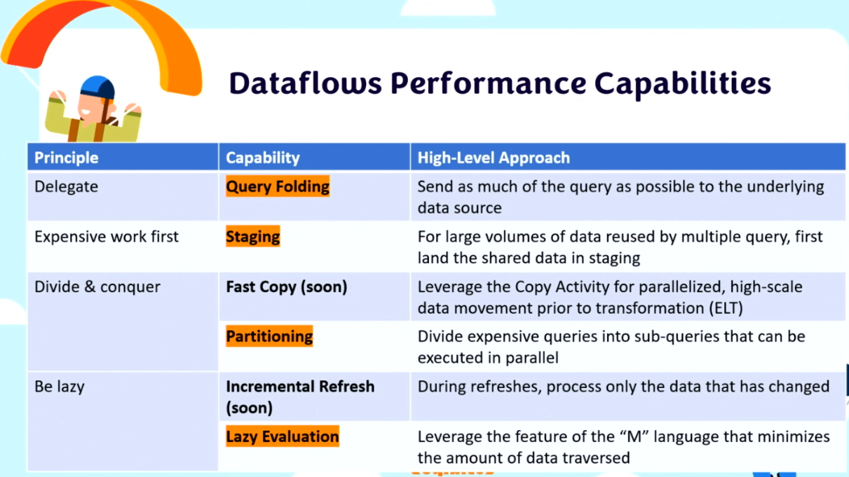
Dataflows Gen2 – performance optimization and AI infused experiences. 4 performance principles – delegate to the most capable resource, sometimes you have to do the most expensive thing first, divide and conquer, be lazy do as little work as possible.
Query folding – known as query delegation, push down, remote/distributed query evaluation. Wherever possible, the script in Power Query Editor should be translated to a native query. The native query is then executed by the underlying data source.
Staging – load data into Fabric storage (staging lakehouse) as a first step. The staged data can be referenced by downstream queries that benefit from SQL compute over the staged data. The staging data is referenced using the SQL endpoint on the lakehouse. Staging tips – data sources without query folding like files are great candidates for staging. For faster authoring, have a different dataflow for staging and another for a transformations.
Partitioning – a way to break down a big query into smaller pieces and run in parallel. Fast copy does this in the background.
Lazy evaluation – power query only evaluates and executes the necessary steps to get the final output. It checks step dependencies then applies query optimization to make the query as efficient as possible.
AI infused experiences – column by example, table by example, fuzzy merge, data profiling, column pair suggestions. Table by example web is pretty awesome. You can extract any data from any HTML page and have it figure out how to turn that HTML into the table you want to see. Basically allows you to screenscrape as part of your ETL process and it will refresh if any changes are done on the website. Table by example for a text/csv is also amazing, it can try to figure out how to take a human readable file and split it into multiple columns. Game changers!
Website Analytics in my pocket using Microsoft Fabric by Catherine Wilhelmsen
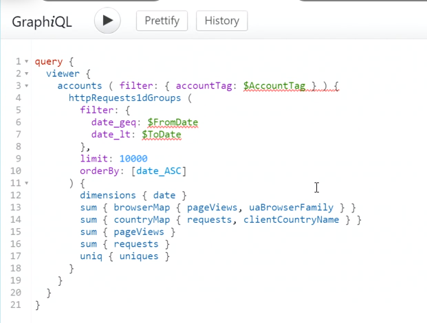
Catherine built her own website and blog hosted on Cloudflare. Cloudflare has an API that pulls all the stats. To build this, she worked with Cloudflare GraphQL API. They have one single endpoint for all API calls and queries are passed using a JSON object.
Data is returned as a json object. She built the orchestration inside of Fabric Data Factory.
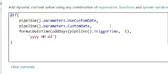
First portion is to set the date, she has this check if she wants to use today’s date or the custom date.
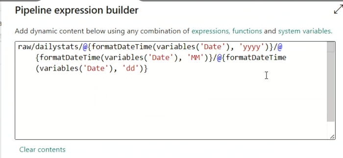
After that, she accesses the data using a copy data activity. Last step is to copy that data into a lakehouse. The file name is dynamic so she can capture the date that the data was pulled from.
The destination is a Lakehouse where she can build a report off of it. The best part of the copy data is the ability to map that nested JSON response into destination columns within the lakehouse. As a bonus for herself, she made a mobile layout so she can open it on her phone and keep track of it on the go.
Next steps for her project – see country statistics, rank content by popularity, compare statistics across time periods.
Calculation Groups & C# the perfect couple by Paulina Jedrzejewska
What makes it a perfect couple? We can add C# to our calc group dev to make it much more flexible.
Calc groups don’t allow you to create a table with customizable sorting of the measures and have measures not using the calc group within the same visual. For example, if I have previous year and current year in my calc group, it would display all of my current year measures together and all the prior year measures together, but I may want to see current year sales right next to prior year sales instead of having current year sales, revenue, cost, etc. then have the prior year much further away. To solve this, we will create separate measures for each time intelligence option. But why do that by hand when we can automate?
What can we automate? Creating & deleting measures, renaming objects, moving objects to folders, formatting objects.
Why automate? Works through a bunch of objects in seconds, reusable, homogeneous structure and naming, and no more tedious tasks for you!
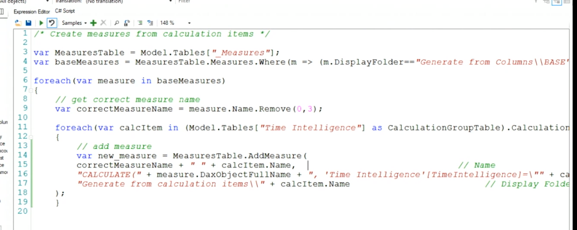
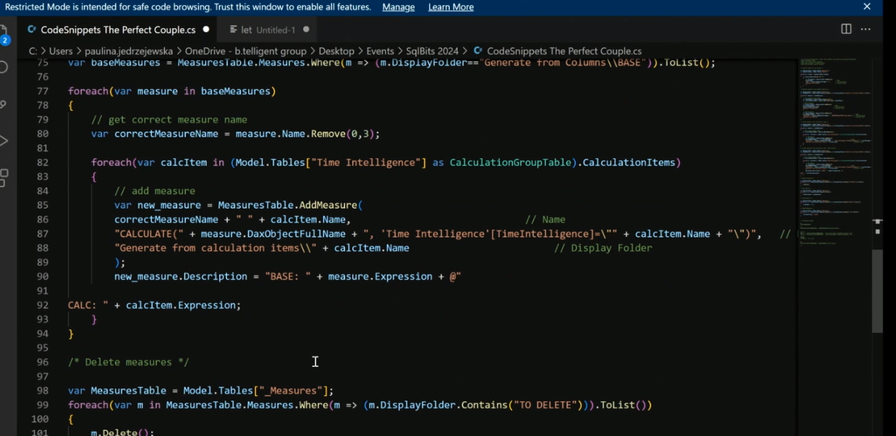
For this demo, we will use Tabular Editor 2, PBI Desktop, Code Editor (visual studio code). She uses a .cs file to script out the code. All the columns in the fact table that will be turned into a measure have a prefix of “KPI”.
column.DaxObjectFullName will give you the full table, column reference which allows you to reference that dynamically within C# code.
Calculation groups are essentially a template for your measures. It’s a feature in data modeling that allows you to take a calculation item and use it across multiple measures. These are very useful for time intelligence, currency conversion, dynamic measure formatting, and dynamic aggregations.
When creating a calc group, always be sure to include one for the actual measure value by using SELECTEDMEASURE(). You can also refer to other calculation items within others as a filter.
Now that we have a calc group, the C# can loop through every base measure and through all the calculation group items and generate our new measures off of that. Remember all the code is in her github 🙂
Another great use case for C# is to add descriptions to all the measures.
Power BI encoding is a powerful optimizing option that is often overlooked because it’s not visible in neither the Power BI Desktop tool nor in Power BI Service. Natively, the VertiPaq engine in Power BI investigates all columns in the data model and determines how it can store that data most efficiently. To achieve maximum compression, the VertiPaq engine starts by encoding each column which determines the method of compression applied to that column. There are a couple types of encoding – value and hash.
Value and hash encoding work differently and can drastically impact the size and performance of your data model. Koen Verbeeck defines these two types of encoding very well (blog):
Value encoding – Here the value of the cell itself is used. It’s possible a mathematical operation is included. For example, if a column contains the values 10,000 and 10,001, SSAS can subtract 10,000 from the values and keep the results 0 and 1, which can be stored using fewer bits. Whenever the data is needed, SSAS only needs to add 10,000 again to retrieve the original values. Typically columns used in aggregations benefit from value encoding.
Hash encoding – With this type of encoding, the values are transformed into meaningless integers. This transformation step is then kept in a dictionary, so SSAS can translate the integers back to the original value. Hash encoding is used for string columns and for every column where value encoding is less efficient (for example if the column is very sparsely distributed). Typically columns used as group-by columns or foreign keys benefit from hash encoding.
In general, your data model will consume less storage and populate visuals faster if you have more columns that are compressed using value encoding. Value encoding is only available for numerical columns, which is part of the reason star schema is so powerful in Power BI. If you have a standard star schema, the table with the greatest number of rows/records will be a fact table which will have entirely numerical column types. Ideally, all of these numerical columns will be value encoded by default, but occasionally the VertiPaq engine requires a little extra guidance. While going through the steps below, you can monitor your dataset size and column encoding using the VertiPaq Analyzer.
Unfortunately, there’s not currently a way to check or even change the encoding for a column within the Power BI desktop. Thankfully, the guru’s over at Tabular Editor have exposed this for report developers. If you’re unfamiliar with Tabular Editor, I highly recommend downloading the free version (Tabular Editor 2) and checking out the getting started information on their website. To enable changing the Encoding Hint Type, you will need to go to File > Preferences and ensure that “Allow unsupported Power BI features (experimental)” box is checked. Without this box checked, it will appear that your code is running but no changes will be made within the model.
Once inside Tabular Editor, navigate to the C# script window and input the following code to see the current encoding type. If the encoding type is default (like the example below), this means the engine will determine the encoding on the fly.
Templated code snippet - all caps values are variables
var table_TABLENAME = Model.Tables["TABLENAME"];
var column_nameid = table_TABLENAME.Columns["COLUMNNAME"];
Output(column_nameid.EncodingHint);

Example in screenshot
var table_allocatedcharges = Model.Tables["Product"];
var column_acudfid = table_allocatedcharges.Columns["ProductKey"];
Output(column_acudfid.EncodingHint);
Unfortunately, you cannot set the encoding type itself, but you can set the encoding hint to encourage that column to be encoded one way or another. To change this encoding hint type, use the code below within that same C# editor window and hit the green run arrow. One of the major benefits of using a tool like Tabular Editor is programmability. In the script below, we are using a foreach statement to loop through all of the Int64 columns within our data model and setting the encoding hint to Value.
// for all Int64 columns set EncodingHint
foreach(var column in Model.Tables.SelectMany(t => t.Columns))
{
if(column.DataType == DataType.Int64)
column.EncodingHint = EncodingHintType.Value;
}
Let’s run the first script again and see if that EncodingHintType changed. And boom! Now it says Value! Please note, if yours still says Default, navigate to File > Preferences and ensure that “Allow unsupported Power BI features (experimental)” box is checked. Unfortunately, changing the encoding hint type falls under the unsupported Power BI feature category.
If you are using the VertiPaq Analyzer, you may notice that not all Int64 columns may be encoded as Values. Unfortunately, there are limitations to which columns will be encoded even after running the script. Keep in mind, the encoding hint type is just a hint. This community post covers some of the exceptions that fellow developers have run into: VertiPaq Decimal Columns Encoding Type Help. Marco Russo, Microsoft MVP & co-author of SQLBI, summarizes this phenomenon by saying “The hint is not enforcement. If the column cannot be represented as a value encoded column, it’s compressed as a hash encoded column. For example, the value encoded is 32-bit, if you have values outside the 32-bit range, it will be always hash-encoded. Also keep in mind that encoding hints are applied to the following refresh.”
In the sample script, we only looped through Int64 whole number columns. You can adjust this script to also look for decimal type columns for further optimization. Don’t forget to use VertiPaq Analyzer and enjoy watching that dataset shrink!
Let’s set the scene. You’ve built a wonderful, useful, and descriptive report for your stakeholders with a variety of tooltips that offer deeper insights. They love the tooltips, and have requested more for other visuals, but when they get to the boardroom to present, they are unable to hover over any numbers without the tooltip blocking the context of that data point. Because they love the tooltips for their personal exploration, they don’t want them disabled permanently and have requested a way to temporarily turn them off for presentations. This blog was inspired by Steve Hughes (you may know him) complaining about “too many tooltips in the way of my data”.
This one is for you, Dad.
Tooltips are useful for personal exploration, but not shared exploration.
2. Open your Power BI report and create a duplicate page for the page you would like to disable tooltips on. To do this, right click on the page and select “Duplicate Page”.
3. Rename the new page something like “[original page name] – No Tooltip” by right-clicking on the new page tab. We are also going to hide this page.
4. Next, navigate to the View tab in the upper ribbon and select the “Selection” pane. This will bring up a list of all the visuals on your page.
5. Click to your first visual in the list with a tooltip and in the “Visualizations” pane navigate to the “General” setting to toggle “Tooltip” to off.
6. Repeat by clicking down the list in the selection pane and Power BI will keep opening the Visualization pane to the General tab for easy toggling. Pretty slick. Keep repeating until all your visuals have this toggle turned off. Keep in mind, not all your all your visuals have a tooltip like titles, text boxes, etc. To close the selection panel, select “Selection” in the upper ribbon to close that panel or select the “X” at the top of that panel.
7. Time to add our icon! Go to “Insert” in the top ribbon and select “Image” then choose the downloaded icon for magnifying glass without check box. This will signal to end users that there are no tooltips turned on for this page.
8. After resizing and positioning the magnifying glass, in the “Visualization” pane turn on Action and select Type “Page navigation” & set Destination for your original page (Overview in this example). I also turn on Tooltip (the only one for this entire page promise!) for this and instruct users to “Click here to turn on tooltips”.
9. Finally, go back to your original page and repeat steps 7 and 8 with the magnifying glass with a check mark to signify tooltips are on. To your end users, this will feel like a button and by keeping visuals on a separate page, you’ll see a minimal impact to performance.
PRO TIP
To have a true button experience, use the “Properties” section of the “General” tab in the “Visualizations” pane to have the visuals align perfectly and be the exact same size.


