 As I mentioned in my original post, Exploring Excel 2013 as Microsoft’s BI Client, I will be posting tips regularly about using Excel 2013. Much of the content will be a result of my daily interactions with business users and other BI devs. In order to not forget what I learn or discover, I write it down … here. I hope you too will discover something new you can use. Enjoy!
Sparklines and Dashboards
There are a lot of visualization possibilities with Excel. When creating dashboards, sparklines are a good visualization of what happened over a data series. My goal was to add sparklines to a pivot table so it could be added to a dashboard. After many failed attempts, I was able to get the following to work.
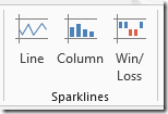
On the INSERT tab, you will find the Sparklines options. In my pivot table I am going to add Line and Column Sparkline visualizations using the MyVote submission counts.
Here are the steps that I used to add this visualization to my pivot table.
First, I created a pivot table with Submission Count as the measure, the rows were the Poll Categories, and the columns are the quarters of the year. Here is what the original data looks like.
In this case, I kept the Grand Totals for both columns and rows turned on. I am going to use these areas as the targets for the sparklines. I am going to use lines for trends over time on the Grand Total column. Then I am going to use the column visualization to show the category distribution on Grand Total row.
Adding the Line Sparkline
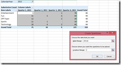
To add the line sparkline, select all of the data cells (no grand totals). Next, select the Line Sparkline option. This will open the Create Sparklines dialog. In the dialog, you can see the Data Range is already populated with the highlighted cells. The Location Range is empty as shown below.
Next, you select the columns in the Grand Total column, and that cell range will be added to the Location Range field. This will put the sparklines in those columns and they will match the data trend. For clarity, the final step would be to change the column name to “Trend” and change the font color to white so the text is not seen. Here is the result.
Adding the Column Sparkline
Next up, we will add the Column Sparkline. Highlight the same cells as before. Once the cells have been highlighted, select the Column Sparkline option. Select the Grand Total row for the location. This will show the distribution within the quarter for the categories. Changing the font to white does not hide the value in this case. I actually reduced the font size to 1 to make it nearly invisible. (There is no transparent font available.) Here is the result.
I also added lower right corner by selecting the Grand Total column cells as the data and that cell as the location to get a consistent look at distribution. One other note, the Grand Total row is called “Trend” as well because they have to have the same name. But, overall, this was the look I was working toward.
Limitations and Nuances with Sparklines
Now for the stuff that doesn’t work as you would like. Sparklines are technically not part of the pivot table. As a result, the table needs to be static in shape. This means rows and columns need to stay the same in count and position.
I am going to add a category slicer to my example. When I select the Entertainment category, all of the sparklines are “stranded” in space. Quarter 2 disappears because it has no data and as a result the trendlines are no longer in the table. This is also true for the columns as four categories are eliminated by the filter. Worse yet, if you look at the filter, you will notice we have no poll submissions in the News category. When that is added the sparklines will end up in the last data row as opposed to the Grand Total sections.
Sparklines are a nice tool to have, but you need to understand what is the best way to use them in the context of what you are doing.
Reference and Credit
I ran across this during my search for how sparklines work in pivot tables: http://answers.microsoft.com/en-us/office/forum/office_2010-excel/how-do-you-insert-a-sparkline-into-a-pivot-table/e072570d-b367-41f1-b2d6-2dbe939db311. As I note with the limitations to my solution, the forum post above calls out some alternatives which allow for more dynamic approaches, but they also involve coding. Furthermore, the comment from Andrew Lavinsky (MVP) confirmed that this was possible and that it is supported in SharePoint Excel Services.


Reblogged this on Sutoprise Avenue, A SutoCom Source.
You have very clear and informative writing skills , Awesome .. I am now you fan and follower